

 полная версия
Practical Exercises in Elementary Meteorology
In general, we naturally expect to find that the temperature decreases as one goes poleward from the equator; from lower latitudes, where the sun is always high in the heavens, to higher latitudes, where it is near the horizon, and its warming effect is less. But there are some curious exceptions to this general rule. The lowest temperatures on the January isothermal chart (-60°) are found in northeastern Siberia, and not, so far as our observations go, near the North Pole. If you find yourself at this “cold pole,” as it is called, in Siberia in January, you can reach higher temperatures by traveling north, south, east, or west. In other words, here is a case of increase of temperature in a northerly direction, as well as east, south, and west. Again, there is a district of high temperature (90°) over southern Asia in July, from which you can travel south towards the equator and yet reach lower temperatures.
In our winter months the contrasts of temperature in the United States are, as a rule, violent, there being great differences between the cold of the Northwest and the mild air of Florida and the Gulf States. In the summer, on the other hand, the distribution of temperature is relatively equable, the isotherms being, as a rule, far apart. In summer, therefore, we approach the conditions characteristic of the Torrid Zone. These are uniformly high temperatures over large areas. The same thing, on a larger scale, is seen over the whole Northern Hemisphere. During our winter months the isotherms are a good deal closer together than they are during the summer, or, in more technical language, the temperature gradient between the equator and the North Pole is steeper in winter than in summer.
CHAPTER VI.
WINDS
The observational work already done, whether non-instrumental or instrumental, has shown that there is a close relation between the direction of the wind at any station and the temperature at that station. Our second step in weather-map drawing is concerned with the winds on the same series of maps which we have thus far been studying from the point of view of temperature alone.
In the second column of the table in Chapter VIII are given the wind directions and the wind velocities (in miles per hour) recorded at the Weather Bureau stations at 7 A.M., on the first day of the series. Enter on a blank weather map, at each station for which a wind observation is given in the table, a small arrow flying with the wind, i.e., pointing in the direction towards which the wind is blowing. Make the lengths of the wind arrows roughly proportionate to the velocity of the wind, the winds of higher velocities being distinguished by longer arrows, and those of lower velocities by shorter arrows. The letters Lt. (= light) in the table denote wind velocities of 5 miles, or less, per hour.
When you have finished drawing these arrows, you will have before you a picture of the wind directions and velocities all over the United States at the time of the morning observation on this day. (See solid arrows in Fig. 26.)
The wind arrows on your map show the wind directions at only a few scattered points as compared with the vast extent of the United States. We must remember that the whole lower portion of the atmosphere is moving, and not merely the winds at these scattered stations. It will help you to get a clearer picture of this actual movement of the atmosphere as a whole, if you draw some additional wind arrows between the stations of observation, but in sympathy with the observed wind directions given in the table and already entered on your map. These new arrows may be drawn in broken lines, and may be curved to accord in direction with the surrounding wind arrows. Heavier or longer lines may be used to indicate faster winds. (See broken arrows, Fig. 26.)
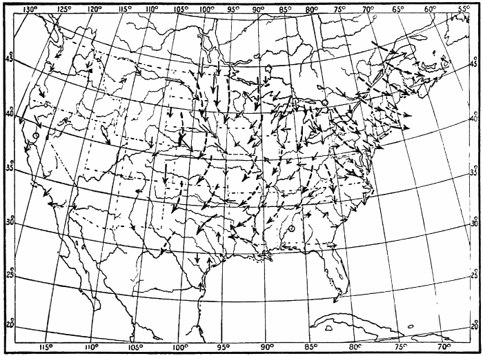
Fig. 26.—Winds. First Day.
It is clear that the general winds must move in broad sweeping paths, changing their directions gradually, rather than in narrow belts, with sudden changes in direction. Therefore long curving arrows give a better picture of the actual drift of the atmospheric currents than do short, straight, disconnected arrows.
Study the winds on this chart with care. Describe the conditions of wind distribution in a general way. Can you discover any apparent relation between the different wind directions in any part of the map? Is there any system whatever in the winds? Write out a brief and concise description of the results of the study of this map.
Enter on five other blank maps the wind directions given in the table in Chapter VIII for the other five days of the series, making, as before, the lengths of the arrows roughly proportionate to the velocity of the wind, and adding extra broken arrows as suggested. (See Figs. 27-31.)
A. Study the whole series of six maps. Describe the wind conditions on each map by itself, noting carefully any system in the wind circulation that you may discover. Examine the wind velocities also. Are there any districts in which the velocities are especially high? Have these velocities any relation to whatever wind systems you may have discovered? If so, include in your description of these systems some consideration of the wind velocities as well as of the wind directions.
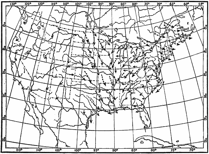
Fig. 27.—Winds. Second Day.
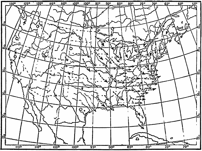
Fig. 28.—Winds. Third Day.
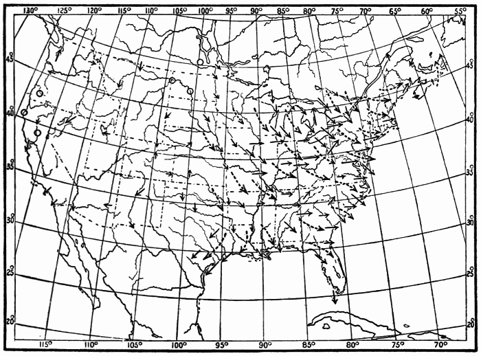
Fig. 29.—Winds. Fourth Day.
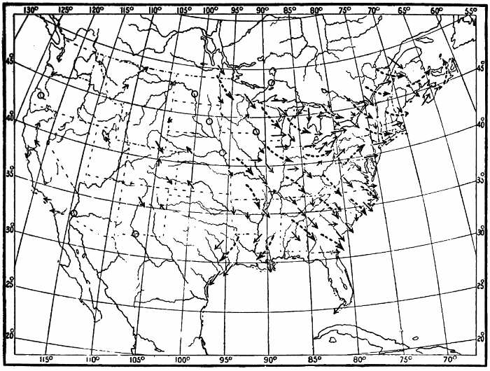
Fig. 30.—Winds. Fifth Day.
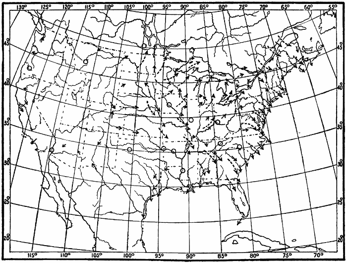
Fig. 31.—Winds. Sixth Day.
B. Compare each map of the series with the map preceding it. Note what changes in direction and velocity have taken place at individual stations. Group these changes as far as possible by the districts over which similar changes have occurred. Compare the wind systems on each map with those on the map for the preceding day. Has there been any alteration in the position or relation of these systems? Write for each day an account of the conditions on that map, and of the changes that have taken place in the preceding 24-hour interval.
C. Write out a short connected account of the wind conditions and changes illustrated on the whole set of six maps.
In the last chapter we studied the progression of the cold wave of low temperatures in an easterly direction across the United States. Notice now the relation of the winds on the successive maps of our series to the movement of the cold wave. Place your wind charts and isothermal charts for the six days side by side, and study them together. The temperature distribution on the second day differs from that on the first. What are the chief differences? Examine the wind charts for these two days. Do you detect any differences in the wind directions or systems on these days? Do these differences help to explain some of the changes in temperature?
Compare the temperature distribution on the second day with that on the third. What are the most marked changes in the distribution? What changes in the winds on the corresponding wind maps seem to offer an explanation of these variations?
Proceed similarly with each map of the series. Formulate, in writing, the general relation between winds and cold waves, discovered through your study of these charts.
Cold Waves in Other Countries.—Cold waves in the United States come, as has been seen, from the northwest, that being the region of greatest winter cold. In Europe, cold waves come from the northeast. This is because northwest of Europe there is a large body of warm water supplied by the Gulf Stream drift, and therefore this is a source of warmth and not of cold. The cold region of Europe is to the northeast, over Russia and Siberia.
Cold waves have different names in different countries. In southern France the cold wind from the north and northeast is known as the mistral, derived from the Latin word magister, meaning master, on account of its strength and violence. In Russia the name buran or purga is given to the cold wave when it blows along with it the fine dry snow from the surface of the ground. This buran is apt to cause the loss of many lives, both of men and cattle. In the Argentine Republic the coolest wind is from the southwest. It is known as a pampero, from the Spanish pampa, a plain.
Cyclones and Anticyclones.—A system of winds blowing towards a common center (such as is well shown over the Gulf States on the weather map for the second day, and over the middle Atlantic coast on the third day) is called by meteorologists a cyclone. The name was first suggested by Piddington early in this century. It is derived from the Greek word for circle, and hence it embodies the idea of a circular or spiral movement of the winds. A system of outflowing winds, such as that over the northwestern United States shown on the maps for the first five days, and over the western Gulf States on the sixth day is called an anticyclone. This name was proposed by Galton in 1863, and means the opposite of cyclone.
CHAPTER VII.
PRESSURE
A. Lines of Equal Pressure: Isobars.—One of the most important weather elements is the pressure of the atmosphere. This has already been briefly discussed in the sections on the mercurial barometer (Chapter II). It was there learned that atmospheric pressure is measured by the number of inches of mercury which the weight of the air will hold up in the glass tube of the barometer. Our sensation of heat or cold gives us some general idea as to the air temperature. We can tell the wind direction when we know the points of the compass, and can roughly estimate its velocity. No instrumental aid is necessary to enable us to decide whether a day is clear, fair or cloudy, or whether it is raining or snowing. Unlike the temperature, the wind, or the weather, the pressure cannot be determined by our own senses without instrumental aid. The next weather element that we shall study is pressure.
Proceed as in the case of the thermometer readings. Enter upon a blank map the barometer readings for the different stations given in the third column of the table in Chapter VIII. When this has been done you have before you the actual pressure distribution over the United States at 7 A.M., on the first day of the series. Describe the distribution of pressure in general terms. Where is the pressure highest? Where lowest? What are the highest and the lowest readings of the barometer noted on the map? What is the difference (in inches and hundredths) between these readings?
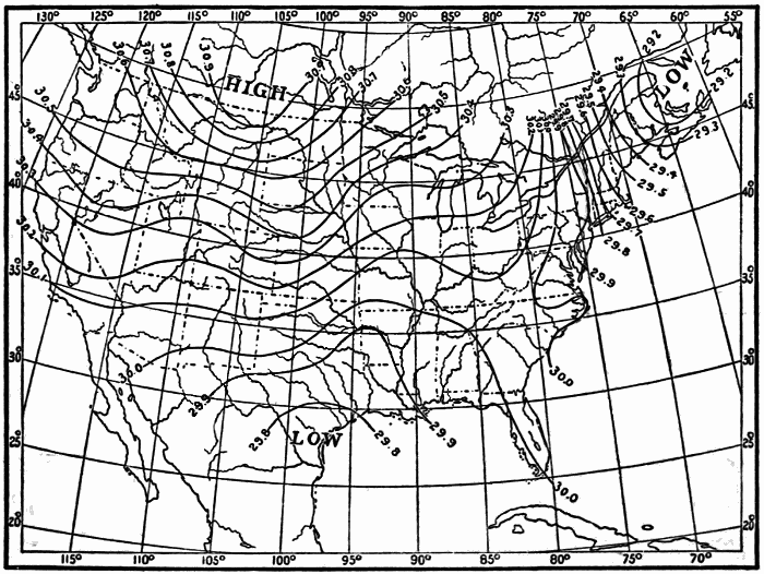
Fig. 32.—Isobars. First Day.
Draw lines of equal pressure, following the same principles as were adopted in the case of the isotherms. The latter were drawn for every even 10° of temperature. The former are to be drawn for every even .10 inch of pressure. Every station which has a barometer reading of an even .10 inch will be passed through by some line of equal pressure. Philadelphia, Pa., with 29.90 must be passed through by the 29.90 line; Wilmington, N. C., with 30.00, must have the 30.00 line passing through it, etc. Chicago, with 30.17 inches, must lie between the lines of 30.10 and 30.20 inches, and nearer the latter than the former. Denver, Col., with 30.35 inches, must lie midway between the 30.30 and 30.40 lines (Fig. 32).
Lines of equal pressure are called isobars, a word derived from two Greek words meaning equal pressure.
Describe the distribution of pressure as shown by the arrangement of the isobars. Note the differences in form between the isotherms and the isobars. The words high and low are printed on weather maps to mark the regions where the pressure is highest and lowest.
Draw isobars for the other days, using the barometer readings given in the table in Chapter VIII. Figs. 33-38 show the arrangement of the isobars on these days.
The pressure charts may be colored, as indicated by the shading in these figures, in order to bring out more clearly the distribution of pressure, according to the same general scheme as that adopted in the temperature charts. Color brown all parts of your six isobaric charts over which the pressures are below 29.50 inches; color red all parts with pressure above 30.00 inches. Use a faint shade of brown for pressures between 29.50 inches and 29.00 inches, and a darker shade for pressures below 29.00 inches. In the case of pressures over 30.00 inches, use a pale red for pressures between 30.00 and 30.50 inches, and a darker shade of red for pressures above 30.50 inches. By means of these colors the pressure distribution will stand out very clearly. The scheme of color and shading may, of course, be varied to suit the individual fancy.
Study the isobaric chart of each day of the series by itself at first. Describe the pressure distribution on each chart.
Then compare the successive charts. Note what changes have taken place in the interval between each chart and the one preceding; where the pressures have risen; where they have fallen, and where they have remained stationary. Write a brief account of the facts of pressure change illustrated on the whole series of six charts.
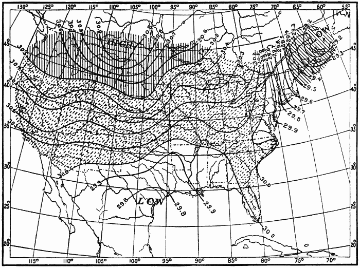
Fig. 33.—Pressure. First Day.
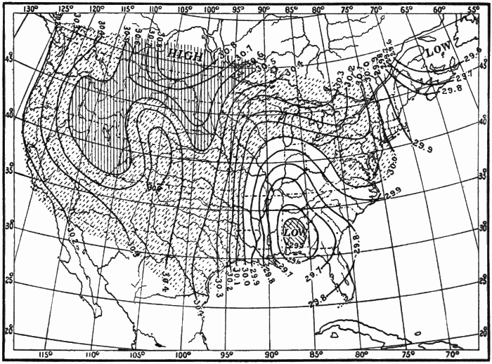
Fig. 34.—Pressure. Second Day.
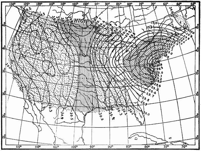
Fig. 35.—Pressure. Third Day.
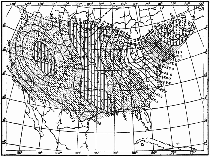
Fig. 36.—Pressure. Fourth Day.
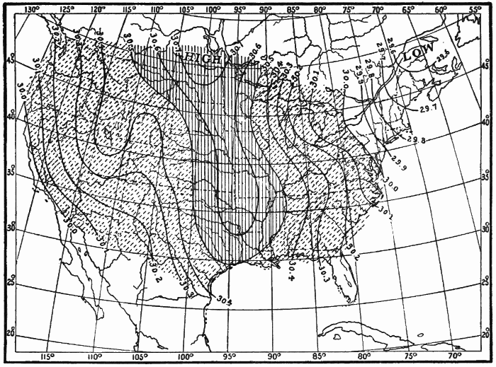
Fig. 37.—Pressure. Fifth Day.
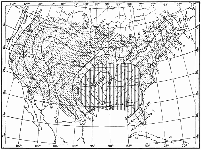
Fig. 38.—Pressure. Sixth Day.
Compare the charts of temperature and of pressure, first individually, then collectively. What relations do you discover between temperature distribution and pressure distribution on the isothermal and the isobaric charts for the same day? What relations can you make out between the changes in temperature and pressure distribution on successive days? On the whole series of maps? Write out the results of your study concisely and clearly.
Compare the wind charts and the pressure charts for the six days. Is there any relation between the direction and velocity of the winds and the pressure? Observe carefully the changes in the winds from day to day on these charts, and the changes in pressure distribution. Formulate and write out a brief general statement of all the relations that you have discovered.
Mean Annual and Mean Monthly Isobaric Charts.—We have thus far been studying isobaric charts based on barometer readings made at a single moment of time. Just as there are mean annual and mean monthly isothermal charts, based on the mean annual and mean monthly temperatures, so there are mean annual and mean monthly isobaric charts for the different countries and for the whole world, based on the mean annual and mean monthly pressures. The mean annual and mean monthly isobaric charts of the world show the presence of great oval areas of low and high pressure covering a whole continent, or a whole ocean, and keeping about the same position for months at a time. Thus, on the isobaric chart showing the mean pressure over the world in January, there are seen immense areas of high pressure (anticyclones) over the two great continental masses of the Northern Hemisphere. These anticyclonic areas, although vastly greater in extent than the small ones seen on the weather maps of the United States, have the same system of spirally outflowing winds. Over the northeastern portion of the North Pacific and the North Atlantic, in January, are seen immense areas of low pressure (cyclones) with spirally inflowing winds. In July the northern continents are covered by cyclonic areas, and the central portion of the northern oceans by anticyclonic areas.
B. Direction and Rate of Pressure Decrease: Pressure Gradient.—In Chapter V we studied the direction and rate of temperature decrease, or temperature gradient. We saw that the direction of this decrease varies in different parts of the map, and that the rate, which depends upon the closeness of the isotherms, also varies. An understanding of temperature gradients makes it easy to study the directions and rates of pressure decrease, or pressure gradients, as they are commonly called. Examine the series of isobaric charts to see how the lines of pressure decrease run. Draw lines of pressure decrease for the six isobaric charts, as you have already done on the isothermal charts. When the isobars are near together, the lines of pressure decrease may be drawn heavier, to indicate a more rapid rate of decrease of pressure. Fig. 39 shows lines of pressure decrease for the first day. Note how the arrangement and direction of these lines change from one map to the next. Compare these lines with the lines of temperature decrease.
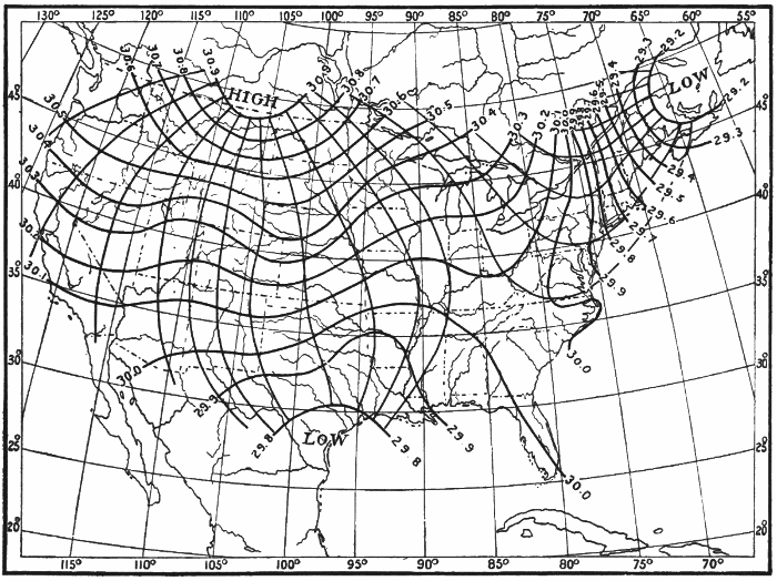
Fig. 39.—Pressure Gradients. First Day.
Next study the rate of pressure decrease. This rate depends upon the closeness of the isobars, just as the rate of temperature decrease depends upon the closeness of the isotherms. Examine the rates of pressure decrease upon the series of isobaric charts. On which charts do you find the most rapid rate? Where? On which the slowest? Where? Do you discover any relation between rate of pressure decrease and the pressure itself? What relation?
When expressed numerically, the barometric gradient is understood to mean the number of hundredths of an inch of change of pressure in one latitude degree. Prepare a scale of latitude degrees, and measure rates of pressure decrease, just as you have already done in the case of temperature. In this case, instead of dividing the difference in temperature between the isotherms (10° = T) by the distance between the isobars (D), we substitute for 10° of temperature .10 inch of pressure (P). Otherwise the operation is precisely the same as described in Chapter V. The rule may be stated as follows: Select the station for which you wish to know the rate of pressure decrease or the barometric gradient. Lay your scale through the station, and as nearly as possible at right angles to the adjacent isobars. If the station is exactly on an isobar, then measure the distance from the station to the nearest isobar indicating a lower pressure. The scale must, however, be laid perpendicularly to the isobars, as before. Divide the number of hundredths of an inch of pressure difference between the isobars (always .10 inch) by the number expressing the distance (in latitude degrees) between the isobars; the quotient is the rate of pressure decrease per latitude degree. Or, to formulate the operation,
R = P / D,in which R = rate; P = pressure difference between isobars (always .10 inch), and D = distance between the isobars in latitude degrees.
Determine the rates of pressure decrease in the following cases:—
A. For a number of stations in different parts of the same map, as, e.g., Boston, New York, Washington, Charleston, New Orleans, St. Louis, St. Paul, Denver, and on the same day.
B. For one station during a winter month and during a summer month, measuring the rate on each map throughout the month, and obtaining an average rate for the month.
Have these gradients at the different stations any relation to the proximity of low or high pressure? To the velocity of the wind?
Pressure Gradients on Isobaric Charts of the Globe.—The change from low pressure to high pressure or vice versa with the seasons, already noted as being clearly shown on the isobaric charts of the globe, evidently means that the directions of pressure decrease must also change from season to season. The rates of pressure decrease likewise do not remain the same all over the world throughout the year. If we examine isobaric charts for January and July, we shall find that these gradients are stronger or steeper over the Northern Hemisphere in the former month than in the latter.
CHAPTER VIII.
WEATHER
Hitherto nothing has been said about the weather itself, as shown on the series of maps we have been studying. By weather, in this connection, we mean the state of the sky, whether it is clear, fair, or cloudy, or whether it is raining or snowing at the time of the observation. While it makes not the slightest difference to our feelings whether the pressure is high or low, the character of the weather is of great importance.
The character of the weather on each of the days whose temperature, wind, and pressure conditions we have been studying is noted in the table in this chapter. The symbols used by the Weather Bureau to indicate the different kinds of weather on the daily weather maps are as follows: ○ clear; ◑ fair, or partly cloudy; ● cloudy; Ⓡ rain; Ⓢ snow.
Enter on a blank map, at each station, the sign which indicates the weather conditions at that station at 7 A.M., on the first day, as given in the table. When you have completed this, you have before you on the map a bird’s-eye view of the weather which prevailed over the United States at the moment of time at which the observations were taken. Describe in general terms the distribution of weather here shown, naming the districts or States over which similar conditions prevail. Following out the general scheme adopted in the case of the temperature and the pressure distribution, separate, by means of a line drawn on your map, the districts over which the weather is prevailingly cloudy from those over which the weather is partly cloudy or clear. In drawing this line, scattering observations which do not harmonize with the prevailing conditions around them may be disregarded, as the object is simply to emphasize the general characteristics. Enclose also, by means of another line, the general area over which it was snowing at the time of observation, and shade or color the latter region differently from the cloudy one. Study the weather distribution shown on your chart. What general relation do you discover between the kinds of weather and the temperature, winds, and pressure?
Proceed similarly with the weather on the five remaining days, as noted in the table. Enter the weather symbols for each day on a separate blank map, enclosing and shading or coloring the areas of cloud and of snow as above suggested. In Figs. 40-45 the cloudy areas are indicated by single-line shading, and the snowy areas by double-line shading.
Now study carefully each weather chart with its corresponding temperature, wind, and pressure charts. Note whatever relations you can discover among the various meteorological elements on each day. Then compare the weather conditions on the successive maps. What changes do you note? How are these changes related to the changes of temperature; of wind; of pressure? Write a summary of the results derived from your study of these four sets of charts.