

Полная версия
We'll pause here to talk about one source of variation—how the survey measures results. Rating anything on a 1−10 scale is notoriously problematic. One person's 10 (“They didn't have what I was looking for, but an employee helped me find a substitute!”) is another person's 5 (“They didn't have what I was looking for! An employee had to help me find a substitute.”). We'll ignore other potential sources of variation like the presence of a rude employee, an overcrowded store, an economic downturn that has everyone on the edge, whether the customer is shopping with children, plus … countless others.
We're not saying that the survey itself ought to be disbanded. Rather, we want to show that the design of (that is, the way we measure) data introduces variation that we often overlook. Ignoring variation means thinking deviations from our expectations reflect low-quality service rather than expected differences inherent in the question itself. And yet businesses will attempt to chase elusive high target numbers (9s and 10s in this case) without understanding that their choices in how they measured the data was the very cause of the underlying variation.
Here's how this could play out. Suppose 50 people leave a review each day, every day, for 52 weeks. This makes 350 surveys a week and 18,200 for the year. With participation like that, you seem to have a good representation of customer perception. Then, at the end of each week, results are tallied—corporate adds up the number of 9s and 10s and divides it by the weekly total, 350—and reports the results on a graph, shown in Figure 3.1. Numbers above the 85% mark get you a pat on the back. Results below 85%, and you're sweating.
Every Monday you get the report and have a phone call with corporate about the results. Imagine the stress of these conversations in weeks 5–9. You're just below the threshold. And when you finally break above in week 10, no doubt caused by the motivation of your boss, week 11 comes along and gives you a new low. This goes on and on.
But what you're looking at in Figure 3.1 is pure randomness. We generated 18,200 random numbers that were either an 8, 9, or 10—representing how different customers vote on positive customer service—and shuffled them like a deck of cards.18 Each “week” we took 350 numbers and calculated the metric. The average percentage of 9s and 10s in the dataset was 85.3% (very close to the true value of 85%), meeting the corporate standard, but each week, simply due to random variation, bounced around that threshold.

FIGURE 3.1 Weekly Customer Survey Results: Percent of Positive Reviews. The horizontal line at 85% represents the target.
Not thinking statistically led to everyone—you, your boss, and the corporate office—chasing improvements in service to drive an arbitrary number up, even as this number was not influenced by such activities.
We term this type of activity the illusion of quantification. It's the pursuit of driving metrics without a clear statistical foundation around what they mean.
Do you see the illusion of quantification in your workplace?
Case Study: Kidney-Cancer Rates
The highest kidney-cancer rates in the United States, measured by the number of cases per 100,000 of population, occur in very rural counties sprawled out across the Midwest, South, and West regions of the country.
Pause to think about why this might be.
Perhaps you suspect, being in rural areas in the interior of the country, the residents have less access to adequate healthcare. Or maybe it's the result of unhealthy living caused by meat-heavy, salt-laden high-fat diets—or too much beer and spirits. It's easy, natural really, to start building narratives around facts. You can already picture researchers starting to devise remediation measures to alleviate the problem.
But here's another fact: the lowest kidney-cancer rates in the United States also occur in very rural counties sprawled out across the Midwest, South, and West—often neighboring the borders of the highest-rate counties.19
How can both be true? How can two cities with similar demographics have so very different results? Every reason you might think of to explain why very rural counties have high rates of kidney cancer would surely apply (to some degree) to their neighboring counties. So, something else must be going on.
Let's take two neighboring counties in rural Midwest, County A and County B, and assume they each have only 1000 residents. If County A has zero cases, its rate would be 0, obviously in the lowest rate category. But if County B has a single case of kidney cancer, its rate would be 100 cases per 100,000 population, giving it the highest rate in the country. It's the low population in the counties causing the high variation, simultaneously producing the highest and lowest rates. In contrast, one additional case in New York County (Manhattan, New York City), with a population over 1.5 million residents, would barely move the needle. Going from 75 cases to 76 cases would change the number of cases per 100,000 from 5 to 5.07.
In fact, this variation was real and measured in an American Scientist article titled, “The Most Dangerous Equation.”20 Figure 3.2 summarizes the results for U.S. counties. The sparsely populated counties, on the left side of the plot, show much higher variation in cancer rates, from 0 up to 20, the highest in the country. As population increases, moving left to right in the plot, the variation starts to reduce, giving a triangular shape. There's much less variation on the right side of the figure, indicating densely populated counties are more robust to additional cases and stabilize around 5 cases per 100,000 of population.
The article shared other examples where small numbers cause high variation. For instance, would you be surprised to learn that small schools have both the best and the worst test scores? One or two students not passing a test can cause a huge swing in overall percentages. Small numbers can lead to extreme results.
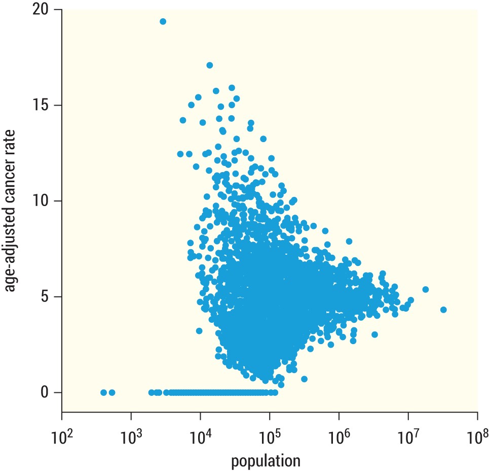
FIGURE 3.2 Reprint of American Scientist figure
PROBABILITIES AND STATISTICS
In the last few sections, we explained variation and talked about how it's a source of uncertainty for many businesses. Uncertainty, in fact, can be managed and this is where probability and statistics enter the picture.
We often use the terms probability and statistics interchangeably, if not together, when describing the mathematics of outcomes. But here we can go a little deeper to truly understand the difference.
Imagine a big bag of marbles. Inside, you don't know what color they are. You don't know their shape or size. You really don't even know how many marbles are in the bag, but you reach in the bag and blindly grab a handful.
Let's stop for a moment. You have a bag of marbles you haven't peeked into and a fistful of glass rolling between your fingers you haven't looked at. You really have no information about what's in your hand or in the bag.
Now here's the difference. In probability, you find out exactly what's in the bag, and use the information to guess what's in your hand. In statistics, you open your hand and use the information to tell us what's in the bag.
Probabilities drill-down; statistics drill-up. Makes sense?
Let's look at two real-life examples:
■ Las Vegas casinos are built on probability. Every time you play a casino game you are pulling from their bag of marbles, made up of wins and losses. There are just enough winning marbles within the casino bag to keep you interested in playing. Casinos understand variation—indeed they've commercialized it through payouts and losses optimized to keep you interested and exhilarated. Over the long term, however, casinos know they will make money because they created the bag from which all marbles are pulled, and they know exactly what's inside. With every bet made, chip laid at the table, and lever pulled on the side of a slot machine, casinos know the underlying probability of your success. If you think about how much data casinos have, you can see that they both live in a world of variation but also have a clear sense of probable outcomes.
■ Political polling is based on statistics. In a casino, the bag of marbles is meticulously designed and is constantly sampled from.
In an election, however, politicians don't know what's really inside the entire bag until election day when all the marbles (i.e., votes) are revealed.21 Politicians only get this one chance to learn what's in the bag—and whether it contains enough winning marbles for them. Before the election, politicians and political parties only have access to a small set of random marbles (called surveys), and they pay a lot of money for that access. Using that sample, they infer the patterns inside the bag and adjust their campaigns accordingly. Because their information is incomplete (and because they often introduce bias and error), they don't always get it right. But when they do, it's the difference between winning an election and not.
Let's take a quick look at some important concepts in probability and statistics in the following sections.
Probability vs. Intuition
Earlier in this chapter, we said that random variation cannot be controlled. But it can be measured, and probability gives us the tools to do it.
Sometimes probabilities make complete sense to us. If you've rolled a fair die or spun a dreidel, you recognize you have a known chance of landing on a specific number (1 in 6) or letter (1 in 4). Simple games of chance make a lot of sense to us. Simple probabilities feel intuitive. Indeed, they make so much sense to us, that they often obscure underlying complexity. Commercials, for instance, play on appeal to simple probabilities by reducing them to something that feels like we intuitively understand it.
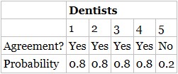
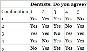
TABLE 3.1 Probability Dentists Agree to an Advertising Claim
You've likely seen this commercial before: “4 out of 5 dentists agree” to an advertising claim, X (X can be whatever you want—chewing gum reduces cavities, or baking soda whitens teeth—it doesn't matter).
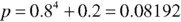
Now, suppose five dentists are sitting in front of you. Knowing that 80% of all dentists agree that X, how likely is it that exactly four out of the five dentists in front of you agree?22
100%? 90%? or 80%?
The actual answer is 41%.
This seems too low intuitively, but it is correct. Let's look at why. Table 3.1 shows one way a sample of five dentists could agree to X.

Or, for brevity,
But there are five different combinations of agreement, where each dentist could the one “No,” shown in Table 3.2
Thus, multiply the original probability by five:

Four out of five dentists may agree, on average, but that's no guarantee that in every sample of five dentists that four will agree to claim X. Going back to our marble analogy, if the bag of marbles contained 80% marbles with yeses and 20% noes, some handfuls of five will have all five yeses. And in the rare case, all five noes. (That's variation for you.)
We share this exercise to highlight, once again, how people underestimate variation, especially when dealing with small numbers. What people expect to see, based on intuition, rarely matches reality when we calculate the probabilities. And underestimating variation causes people to overestimate their confidence in small data. This has been coined the “law of small numbers.” It's “the lingering belief … small samples are highly representative of the populations from which they are drawn.”23
TABLE 3.2 Possible Combinations of 4 out of 5 Dentists Agreeing
Thinking statistically, like a Data Head should, means being mindful of our intuition, realizing it can play tricks on us. (We'll explore several more of these examples and misconceptions in the coming chapters.)
Discovery with Statistics
Statistics is often broken out into descriptive statistics and inferential statistics. You are probably familiar with descriptive statistics even if you don't use the phrase. Descriptive statistics are the numbers that summarize data—the numbers you read in the newspaper or see on the projection screen at work. Average sales last quarter, year-over-year increases, unemployment rates, etc. Measures like mean, median, range, variance, and standard deviation are descriptive statistics and require specific formulas to calculate. Your old Statistics book is full of them.
Descriptive statistics are a deliberate oversimplification of data—a way to condense an entire spreadsheet of company sales data into a few key measures that summarize the main information. Going back to the marble analogy, descriptive statistics is simply counting and summarizing the marbles in your hand.
While useful, we're rarely content to stop here. We want to go the extra step and understand how we can take the information in our hand and make a principled guess to infer the general contents of the entire bag. This is inferential statistics. It's the process of “going from the world to the data, and then from the data back to the world.”24 (We will go deeper into this in Chapter 7.)
For now, let's consider an example. Imagine how you’d react seeing the headline, “75% of Americans Believe UFOs Exist!” after learning it was sampled from 20 tourists at the International UFO Museum and Research Center in Roswell, New Mexico. Do you think you can accurately infer the true underlying percentage of Americans who believe in UFOs based off what you now know about the study?
A Data Head's skepticism meter would go off immediately. The statistic, 75%, is not trustworthy based on the
■ Biased sample. People visiting Roswell would be much more likely to believe in UFOs than the general public.
■ Small sample size. You've learned how much variation small sample sizes introduce. Inferring what millions think based on 20 people doesn't make much sense.
■ Underlying assumptions. The headline specified “Americans” as believing in UFOs simply because the test was taken in America. But the museum, as you might recall, is an international attraction. You don't know that everyone who participated in the survey is an American.
Concepts like bias and sample size are tools of statistical inference that help us understand if the statistics we see or calculate are nonsense. And they're an important part of your toolkit. The underlying assumptions are equally as important to consider, as well. Thinking like a Data Head requires that you don't take assumptions said in a conclusion at face value.
So, as you see data in your work, don't blindly acquiesce to the information you see or even the intuition you feel.
Think statistically. Ask questions. That's what Data Heads do. The upcoming chapters will tell you the questions to ask to help you think statistically.
Statistical Thinking ResourcesEarlier in this chapter, we made clear that we can only scratch the surface on statistical thinking. Fortunately, several great books go into more depth about the topic. Our favorites are:
■ Damned Lies and Statistics: Untangling Numbers from the Media, Politicians, and Activists, by Joel Best (University of California Press, 2001)
■ How Not to Be Wrong: The Power of Mathematical Thinking, by Jordan Ellenberg (Penguin Books, 2015)
■ How to Lie with Statistics, by Darrell Huff (W. W. Norton & Company, 1993)
■ Naked Statistics: Stripping the Dread from the Data, by Charles Wheelan (W. W. Norton & Company, 2013)
■ Proofiness: How You're Being Fooled by the Numbers, by Charles Seife (Penguin Books, 1994)
■ The Drunkard's Walk: How Randomness Rules Our Lives, by Leonard Mlodinow (Pantheon, 2008)
■ The Signal and the Noise: Why So Many Predictions Fail—But Some Don't, by Nate Silver (Penguin Press, 2012)
■ Thinking, Fast and Slow, by Daniel Kahneman (Farrar, Strauss and Giroux, 2013)
CHAPTER SUMMARY
In this chapter, we laid a foundation of statistical thinking from which we'll continue to build upon throughout the book.
Specifically, we described the importance of variation and understanding how it exists within the context of the things we measure. We showed that surveys can have wide variation when they solicit customer opinion. Not because the service was bad (though, it may have been) but because the question itself predisposes wildly different responses that might be characterized as similar until measured.
We also talked about probability and statistics. They help us manage variation by demonstrating that some of it is predictable and that some of it won't even matter over the long term.
Probability drills-down: it uses a large universe of information to tell us what we'll find if we grab random scoops from it. Statistics drills-up: it tells us about the larger universe of information by using the small bits we have access to. Both probability and statistics are tools to help us learn more about when a complete picture of what we want to know remains obscure. Finally, we discussed how you can use your knowledge of probability and statistics to hone your skepticism.
PART II
Speaking Like a Data Head
Part II, “Speaking Like a Data Head,” continues the previous part’s charge to think statistically and question everything. In fact, Part II gives you questions to ask and things to think about whether you're viewing someone else's data project or doing the work yourself. Many of the forthcoming section headers will be named for the very same questions you'll need to ask. Consider it your reference guide for asking tough questions. Here's what we'll cover:
Chapter 4: Argue with the Data
Chapter 5: Explore the Data
Chapter 6: Examine the Probabilities
Chapter 7: Challenge the Statistics
Equipped with these chapters, you'll be able to ask intelligent questions about the data and analytics you encounter in the workplace.
CHAPTER 4
Argue with the Data
“The combination of some data and an aching desire for an answer does not ensure that a reasonable answer can be extracted from a given body of data.”
—John Tukey, famous statisticianAs you become a Data Head, your job is to demonstrate leadership in asking questions about the data used in a project.
Конец ознакомительного фрагмента.
Текст предоставлен ООО «Литрес».
Прочитайте эту книгу целиком, купив полную легальную версию на Литрес.
Безопасно оплатить книгу можно банковской картой Visa, MasterCard, Maestro, со счета мобильного телефона, с платежного терминала, в салоне МТС или Связной, через PayPal, WebMoney, Яндекс.Деньги, QIWI Кошелек, бонусными картами или другим удобным Вам способом.
1
Splunk Inc., “The State of Dark Data,“ 2019, www.splunk.com/en_us/form/thestate-of-dark-data.html .
2
Venture Beat. “87% of data science projects failing”: venturebeat.com/2019/07/19/why-do-87-of-data-science-projects-never-make-it-into-production
3
www.brookings.edu/wp-content/uploads/2016/06/11_origins_crisis_baily_litan.pdf
4
Nate Silver wrote a series of articles describing this in great detail ( fivethirtyeight.com/tag/the-real-story-of-2016 ). Pollsters wrongly assuming independence, just like in the mortgage crisis, was one mistake.
5
Note to our fellow statisticians: We just mean regular confidence, not statistical confidence.
6
K-nearest-neighbor can also be used to predict numbers instead of classes. These are called regression problems, and we'll cover them later in the book.
7
This idea is discussed in an amazingly helpful book: Wilson, G. (2019). Teaching tech together. CRC Press.
8
A robust data strategy can help companies mitigate these issues. Of course, an important component of any data strategy is to solve meaningful problems, and that's our focus in this chapter. If you'd like to learn more about high-level data strategy, see Jagare, U. (2019). Data science strategy for dummies. John Wiley & Sons.
9
2017 Kaggle Machine Learning & Data Science Survey. Data is available at www.kaggle.com/kaggle/kaggle-survey-2017. Accessed on January 12, 2021.
10
There are additional levels of continuous data, called ratio and interval. Feel free to look them up, but we rarely see the terms used in a business setting. And there are situations when the distinction between continuous and count data doesn't really matter. High count numbers, like website visits, are often considered continuous for the purpose of data analysis rather than count. It's when the count data is near zero that the distinction really matters. We'll explore this more in the coming chapters.
11
Here's a quick example of confounding. In a drug trial, if the treatment group consists of only children and no one got sick, you'd be left wondering if their protection from the disease was caused by an effective drug treatment or because children had some inherent protection from the disease. The effect of the drug would be confounded with age. Random assignment between the control and treatment groups prevents this.
12
“Data Is” vs. “Data Are”: fivethirtyeight.com/features/data-is-vs-data-are
13
F. Harrell, Professor and founding Chair of the Department of Biostatistics, Vanderbilt University: www.fharrell.com/post/introduction
14
Thinking, Fast and Slow, by Daniel Kahneman (Farrar, Strauss and Giroux, 2013).
15
The United States has a two-party system.
16
Link to article in the Harvard Data Science Review: hdsr.mitpress.mit.edu/pub/pjl0jtkp.
17
If it seems like we're focused on customer perception too much, it's because it is (1) hard to measure accurately, (2) highly influenced by a biased subset of people, and (3) over-scrutinized by management.
18
In our simulation, the chance of an 8 rating was 15%, the chance of a 9 was 40%, and the chance of a 10 was 45%. Therefore, since we generated this data, we know the true value of the satisfaction metric, receiving a 9 or 10, is exactly 85%.
19
Suppose we flip-flopped the story and told you the rural areas had the lowest kidneycancer rates to start the case study. What reasons would you have listed? Give it a shot. You'll see just how easy it is to craft a story around data.
20
Wainer, H. (2007). The most dangerous equation. American Scientist, 95(3), 249.
21
We're oversimplifying. In an election, political parties are trying to influence the makeup of the bag, both in number of marbles and their color. But even in that case, they still don't know everything inside and rely on sampling.