

Полная версия
Comprensive Optimization Decisions Exchange Traders

Comprensive Optimization Decisions Exchange Traders
Vitaliy Andervin
© Vitaliy Andervin, 2025
ISBN 978-5-0067-4780-7
Created with Ridero smart publishing system
Comprensive Оptimization Decisions
© BT. 2024. Vitaliy Andervin
Introduction
Trading is an exhilarating journey into a world where success is achieved through a deep understanding of market mechanisms and the ability to interpret data. In an era of rapidly changing financial markets, it is precise and timely decisions that are decisive. But to make them, you need to learn not just to follow the charts, but to see what lies beyond the obvious.
A modern trader has a vast array of analytical tools at their disposal: quotes, volumes, delta, limit orders, heatmaps, and much more. However, an abundance of data can be both an advantage and a source of confusion. Only those who can find order in the chaos of market movements gain a real advantage.
This book is designed to help you master the art of reading market data. You will learn how to understand the logic of volumes, understand the work of delta, evaluate the behavior of limit orders, and see hidden signals in heatmaps. Together, we will delve into the intricacies of market analysis, step by step revealing to you all the richness of the trader’s tools.
Why is it important to study market data?
The financial market is a field where every participant strives to achieve their goals. Some aim to protect their assets, while others seek to make a profit. Large funds, algorithmic systems, and retail traders all leave their “traces” in market data.
These traces can reveal:
– Where major players are accumulating positions.
– Which levels act as support or resistance.
– When the price is preparing for a reversal or continuation of its movement.
– Which movements are manipulations and which reflect the true market sentiment.
By studying the data, you gain access to the “language of the market,” which helps you understand what is really happening behind the visible price movements.
What Awaits You in This Book
This book will be your guide to the world of market data.
Inside, you will find:
– Simple and accessible explanations of complex concepts.
– Real market examples to help reinforce theoretical knowledge.
– Practical tips for building effective trading strategies. We will cover:
– Volumes: How to understand market activity through volume analysis.
– Delta: How to distinguish the strength of buyers and sellers.
– Limit Orders: Their impact on liquidity and price movement.
– Heatmaps: How to interpret data on limit orders. Low Liquidity Areas:
– How to use these zones to identify entry and exit points.
– Each chapter combines theory and practice, enabling you to immediately apply the knowledge gained to real market scenarios.
Your Path to Professional Mastery
This book is just the beginning of your journey. Here, we lay the foundation for a deeper exploration of market mechanisms.
In the second book, we will delve into the intricacies of market data – a powerful tool that reveals the inner structure of market interactions. We will cover how to analyze orders, the tape of prints, limit trades in the order book, and more.
The third book will bring everything together, helping you craft comprehensive trading strategies tailored to any market condition.
About the Author
Vitaliy Andervin is a trader for whom the market has become more than just a profession. He believes trading is an art where every trade demands an understanding of the market’s underlying mechanisms. For over a decade, he has applied and analyzed market data, specializing in volumes, delta, and limit orders.
Vitaliy is convinced that success in trading is achieved not through automated systems but through conscious understanding of market data and precise decision-making. His methodology helps traders of all skill levels view the market from a new perspective.
Let this book be your first step into the world of professional trading. Learn, apply, practice. Each new skill brings you closer to success, and the market always opens new opportunities for those ready to seize them. Good luck on this journey!
Contents
Chapter 1: Fundamentals of Market Data
– Volumes and Their Importance
– Delta as an Indicator of Strength
– The Role of Market Orders
Chapter 2: Price Level Details and Market Data
– Volume and Its Interpretation
– The Impact of Ticks and Time Intervals
– Levels of High Interest
– Aggregated and Staggered Trades
Chapter 3: Volume and Delta Profiles
– Horizontal Volume Profile
– Vertical Volume Profile
– Horizontal Delta Profile
– Vertical Delta Profile
Chapter 4: Limit Orders as a Component of Market Data
– Introduction to Limit Orders and the Order Book
– Gradation of Limit Orders
– Heatmap of Limit Orders
– Low Liquidity Zones
– Practical Use of Limit Orders
Conclusion
Summary of Market Data Insights
Preparation for Footprint Analysis in Future Books
Chapter 1: Footprint as an Analysis Tool
The world of trading is about choosing the right tools, approaches, and data for analysis. Some traders rely on technical analysis: patterns, trendlines, and indicators. Others seek a deeper understanding of market structure through data analysis.
The footprint chart reveals the hidden dynamics of the market and the intentions of its participants. It is a mirror of the market process. Each trade is part of a larger picture, displaying the balance between buyers and sellers, key levels of activity, and significant changes.
Unlike technical analysis, which is based on historical data, the footprint chart provides an accurate view of the current situation. While technical analysis offers a broad overview, the footprint chart delivers details. It’s like art: some see brushstrokes, others notice textures.
The market is a battle for profit. The footprint chart helps you see the process, understand market logic, and make decisions when all factors align.
Section 1: What is a Footprint Chart Definition of a Footprint Chart:
– A footprint chart is a visualization of market trades, showing how many contracts were executed at a given price at a specific moment.
– It separates trades into Bid (sales) and Ask (purchases).
Role of the Footprint Chart in Analysis:
– Identifying accumulation and distribution zones.
– Assisting in determining market sentiment and activity.
Section 2: Types of Footprint Data Volumes at Price Levels:
– The total number of trades at a specific price.
– Identifying key support and resistance levels.
Bid and Ask Balance:
– Comparing buyer and seller activity.
– Determining the dominant side of the market.
Delta Within the Footprint:
– The difference between purchases and sales at each level.
– How delta helps uncover hidden volumes.
Section 3: Practical Applications of the Footprint Chart
Accumulation and Distribution Zones:
– How to identify areas where large players are building or unloading positions.
– Examples of analyzing zones of high activity.
Detecting Manipulations:
– Using the footprint chart to identify “false moves.”
– Recognizing artificial price holding.
Trend and Reversal Analysis:
– How the footprint chart helps identify the start or end of a trend.
– Examples of analyzing reversal patterns.
Section 4: Examples of Data Visualization Reading Footprint Charts:
– Step-by-step explanation of chart structure.
– Examples of analyzing volumes and delta on a footprint chart.
Data Interpretation:
– How to accurately read Bid/Ask data.
– Analyzing real chart examples.
Real-Time Footprint Analysis:
– Configuring a platform for analysis.
– How to use the footprint chart for immediate decision-making.
Section 1: What is a Footprint Chart
Immerse yourself in the world of footprint charts – a tool that unveils the true structure of the market. It’s more than just visualization: the footprint chart is an X-ray of trade flows, revealing what standard charts cannot show.
The footprint chart organizes market data streams, displaying volumes, prices, and the balance of supply and demand at each level. Each element of the chart tells a story: some market participants defend their positions, others attack, and still others seek opportunities to enter the game.
What happens at each price level? How do buyers and sellers interact?
With the footprint chart, these questions are no longer a mystery.
You will learn to identify:
– Precise trading volumes: pinpointing areas of accumulation and distribution.
– Market sentiment: determining which forces – buyers or sellers – are dominant.
– Key zones of activity: levels where major players are active.
The footprint chart opens the path to conscious understanding of market processes for traders. It’s the language of the market, enabling you to forecast price movements, observe the actions of major players, and recognize moments when the market is ready to reverse or continue its trend.
This section will serve as the foundation for mastering the footprint chart as a key analytical tool. Welcome to a world where every trade tells a story!
Definition of a Footprint Chart
The footprint chart provides traders with a unique analytical tool, offering a clear view of market activity by breaking down trades into buy (Ask) and sell (Bid) orders. This approach gives deeper insight into who is dominating the market at any given moment.
Segmentation of Trades into Bid and Ask
The footprint chart visually displays the balance between supply and demand, enabling traders to quickly assess the market situation.
Buy Trades (Ask):
– Green values on the footprint chart represent the volume of buy trades. These occur when buyers accept the sellers’ price.
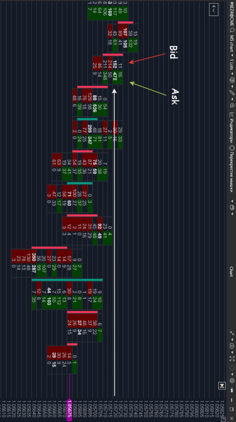
– For example, at the price level of 1.0570, the Ask volume is 526 contracts, signaling significant buyer interest.
Sell Trades (Bid):
– Red values on the footprint chart indicate the volume of sell trades. These occur when sellers accept the buyers’ price.
– For instance, at the price level of 1.0564, the Bid volume is 350 contracts, pointing to active seller dominance.
Example of Footprint Data Interpretation
The following illustration shows data where each row corresponds to a specific price level with displayed volumes:
– At the price level of 1.0572, the Ask volume is 472, while the Bid volume is 152. Buyers exhibit dominant influence.
– At the price level of 1.0564, the Bid volume is 350, exceeding the Ask volume of 287, indicating seller pressure.
Importance of Analysis
Color Coding:
Green values represent buy volumes, while red values indicate sell volumes. This visual differentiation makes it easy to quickly determine who controls the market.
Key Levels:
High Bid and Ask volumes often highlight zones of support or resistance. For instance, significant volumes at the 1.0564 level could signal the formation of resistance.
The footprint chart makes the market more transparent, helping traders identify where buyer and seller activity is concentrated. With this tool, traders can develop more informed strategies, avoiding false signals and speculative assumptions.
The footprint chart stands out among other analytical tools for its ability to deeply visualize market data. This enables traders to see the distribution of trades across price levels, identify key activity zones, and make more informed trading decisions.
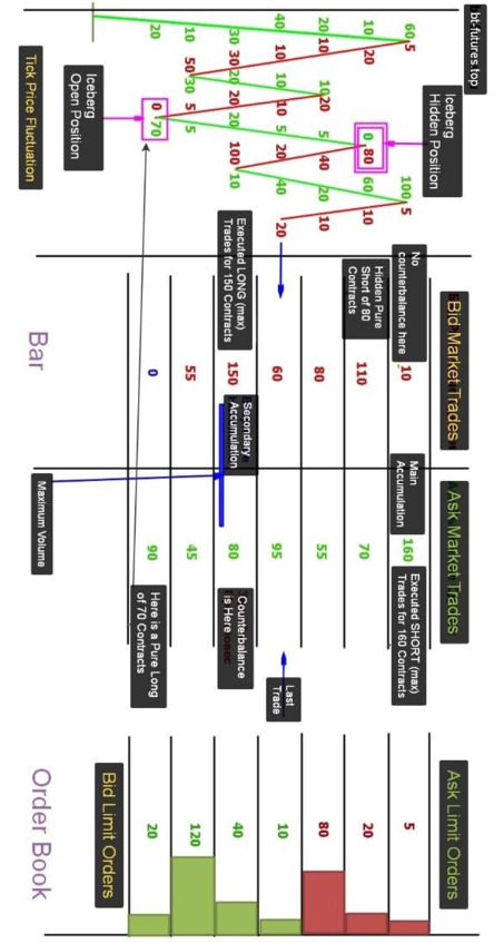
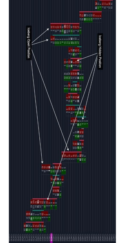
The presented image highlights essential elements of analysis, such as market and limit orders, iceberg positions, and accumulation levels. Each of these elements helps to understand the dynamics of market forces, identify critical levels, and determine the balance between buyers and sellers.
Key Elements of the Image
Tick Price Fluctuation (Left):
This chart shows the price movement within a single bar:
– Green lines indicate price increases, while red lines reflect price decreases.
– Accumulations at key levels are visible on the chart, revealing where the market “fills up” with volumes. For instance, at the 70 level, trades linked to an “Iceberg Open Position” are recorded.
Bar Structure (Center):
The footprint chart clearly visualizes the volumes of market trades:
– Level 100: Recorded 160 Long contracts, marked as “Main Accumulation.” The absence of counterbalance enhances the importance of this level.
– Level 150: Volume of 150 Short contracts. The presence of a counterbalance of 80 Long contracts reduces the significance of this level.
Order Book (Right):
Limit orders are visualized as colored blocks:
– Red blocks represent sell limit orders (Ask).
– Green blocks represent buy limit orders (Bid).
Examples:
– Level 120: Limit buy orders total 120 contracts, potentially indicating a support zone.
– Level 80: Limit sell orders of 80 contracts create a resistance level.
–
Accumulation Levels:
– Primary Accumulation (Level 100):
160 Long contracts. Here, sell limit orders are fully executed, confirming the importance of the level.
– Secondary Accumulation (Level 150):
150 Short contracts, but a counterbalance of 80 Long contracts reduces the significance of the level, even with the presence of “Maximum Volume.”
Iceberg Positions:
– Iceberg Hidden Position (Level 80):
Hidden trades often used by large players to disguise their intentions.
– Iceberg Open Position (Level 70):
Visible trades that can distract and mislead other market participants.
Significance of Visualization
– This image illustrates how footprint analysis enables traders to:
– Identify key market levels where buyers or sellers dominate.
– Recognize false signals, such as “Iceberg Open Positions,” and uncover genuine intentions hidden behind “Iceberg Hidden Positions.”
– Evaluate the balance of power between supply and demand.
– Differentiate critical levels (e.g., without counterbalances) from artificially created points like “Maximum Volume.”
Using footprint data helps traders avoid market traps and make decisions based on facts rather than assumptions. It is a tool that minimizes risks and increases the chances of success.
The Role of Footprint in Analysis
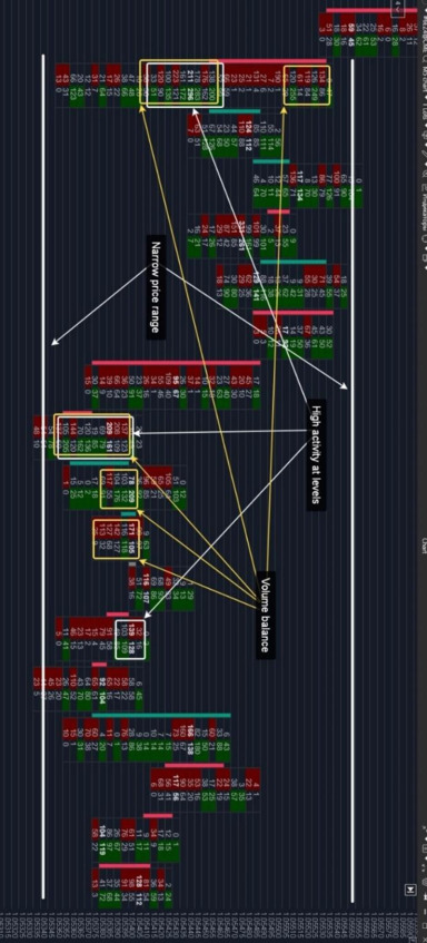
– Accumulation Zones
Accumulation zones represent key market areas where trading volumes concentrate within a narrow price range. These zones often occur during periods of uncertainty when major market participants accumulate positions while avoiding significant price changes.
Understanding the structure of such zones helps traders navigate the current market situation and predict future movements.
Key Characteristics of Accumulation Zones
High Activity at Levels
Increased trading volumes on both Bid (sell) and Ask (buy) sides indicate heightened interest from market participants at these levels.
Narrow Price Range
The price moves within a confined range, signaling consolidation of interests and the absence of dominance by either side.
Volume Balance
Bid and Ask volumes remain relatively balanced, demonstrating equilibrium between buyers and sellers. This balance persists until major players trigger a significant price movement.
Practical Application of Accumulation Zones
Identifying Reversal Points
Accumulation zones often act as precursors to reversals or the start of new trends. Analyzing these zones allows traders to identify optimal entry or exit points in the market.
Revealing Intentions of Major Participants
High trading volumes within a narrow price range indicate hidden actions by large players. Understanding their strategies helps avoid false signals and unwarranted risks.
Example on the Chart
The provided chart highlights accumulation zones:
Areas with high volume activity, marked by yellow and green frames, indicate interest from both buyers and sellers.
The narrow price range demonstrates moments of consolidation, where the price “stalls” before making a significant move.
Balance between Bid and Ask volumes (e.g., 211 on Bid and 296 on Ask) reflects equilibrium between supply and demand.
Accumulation zones offer traders a powerful tool for in-depth analysis of the current market situation, increasing the likelihood of successful market entries.
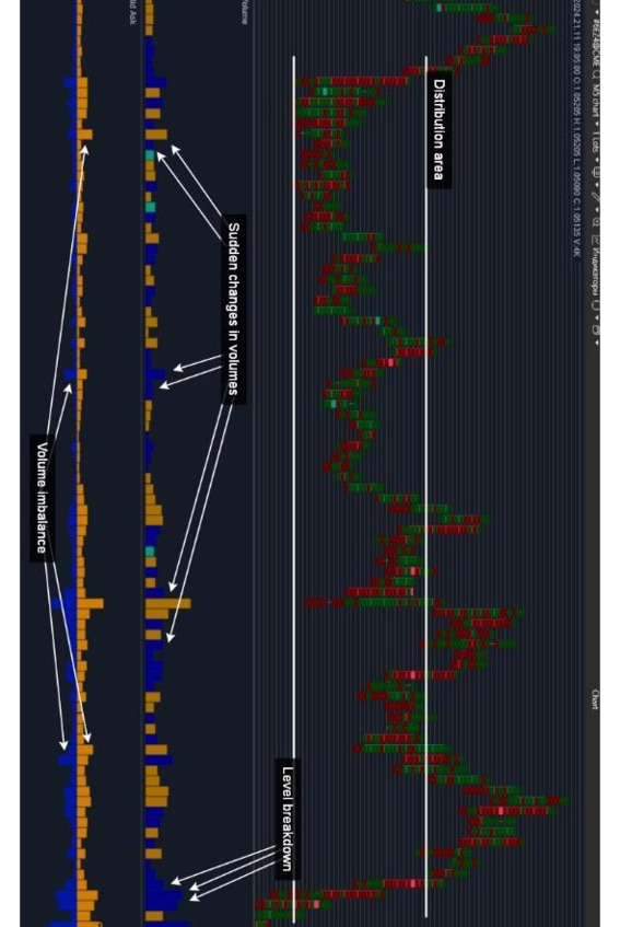
Distribution Zones
What Are Distribution Zones
Distribution zones are key market areas where major participants take profits, close their positions, or reverse the price direction. These zones act as indicators of significant market changes and signal the market’s readiness for further movement.
Key Characteristics of Distribution Zones
– Sharp Volume Changes
Initially, trading volumes increase, reflecting the activity of large players, and then drop sharply, indicating the completion of distribution operations.
– Breakout of the Level
The price moves out of the consolidation zone, accompanied by significant volumes, confirming the market’s readiness to develop a new trend.
– Volume Imbalance
A clear dominance of buy (Ask) or sell (Bid) orders demonstrates the prevalence of one side, becoming a critical factor in forming a new price movement.
Practical Application of Distribution Zones
– Trend Evaluation
Analyzing distribution zones helps traders assess the likelihood of a trend continuation or reversal, reducing the risk of making erroneous decisions.
– Confirmation of Large Players’ Activity
Using footprint data, traders can observe trading volumes within the zone, identifying the true intentions of major participants.
– Reduction of False Signals
Distribution zones, combined with breakout levels, lower the chance of entering trades based on false movements.
Integrating Footprint into Analysis
The footprint provides a clear view of trading volumes within each zone, making the analysis of distribution zones more accurate and effective.
– The presented chart demonstrates:
Sharp Volume Changes: Highlighted on the lower panel, showing the activity of major participants.
– Volume Imbalance:
Marked areas where Ask volumes significantly exceed Bid, indicating buyer dominance.
– Breakout of the Level:
Indicates the moment the price leaves the consolidation zone, signaling the start of a new trend.
Advantages of Using Accumulation and Distribution Zones
– Risk Reduction
Traders avoid opening positions while the price is in a consolidation zone, reducing the likelihood of entering a false move.
– Optimization of Entry Points
Distribution zones provide clear signals for market entry during the formation of a new trend.
– Improved Trade Management
High activity in distribution zones offers a clear understanding of market sentiment, facilitating the selection of exit points and setting protective orders.
Using distribution zones in combination with the footprint is a powerful tool for traders aiming not only to follow the market but to understand its mechanics, predict movements, and minimize risks.
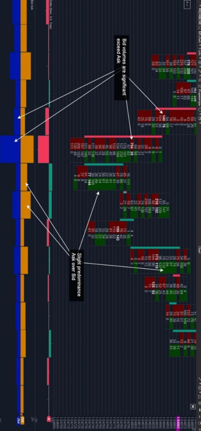
Identifying Market Sentiment
Bid and Ask Analysis
Footprint charts provide traders with a unique opportunity to gain deeper insights into market sentiment by analyzing trade volumes split into buy orders (Ask) and sell orders (Bid). This data segmentation allows traders to identify market participants’ activity and determine which side is dominating at any given moment.
Volume Comparison
High Buy Volume (Ask):
– Indicates buyer initiative, with participants pushing the price upward by actively accepting sellers’ offers.
High Sell Volume (Bid):
– Reflects seller pressure, with market participants controlling the price downward by actively executing buyers’ bids.
Signs of Imbalance
Significant Ask Dominance Over Bid:
– Signals strong buyer interest, with buyers dominating the market, attempting to break resistance and set new price levels.
Significant Bid Dominance Over Ask:
– Indicates substantial seller pressure, with sellers maintaining control and preventing price increases.
Slight Ask or Bid Dominance:
– Suggests a more passive battle between sides:
Slight Ask Advantage: Reflects restrained buyer activity, with buyers not yet ready to drive the market upward.
Slight Bid Advantage: Shows that sellers are holding the price in check without exerting strong pressure.
Application of Sentiment Analysis
Examples of Imbalance on the Chart:
– Significant Bid Dominance: Highlighted at a level with a volume of 754 (Bid) versus 35 (Ask), indicating dominant seller activity.
– Slight Ask Dominance: Identified at a level where buyers are attempting to gain control but have not yet applied noticeable pressure.
This type of analysis helps traders make informed decisions, such as entering the market at levels where one side dominates or waiting for confirmation of activity. Using footprint charts for sentiment analysis reduces the likelihood of false entries, enabling precise assessments of market behavior.
Market Sentiment Signals
The footprint chart is a powerful tool for analyzing imbalances and interactions between market participants at key levels. It enables traders to identify areas where the market is preparing for a breakout, reversal, or continuation of movement.
Key Signals:
Imbalances at Key Levels:
– Sharp Increase in Ask: Indicates buyer pressure. This can signal an impending breakout of resistance.
– Sharp Increase in Bid: Demonstrates seller activity, often preceding a support level breakout.