
 полная версия
The Crown of Wild Olive
4. But observe, it is not enough in general that colour should be gradated by being made merely paler or darker at one place than another. Generally colour changes as it diminishes, and is not merely darker at one spot, but also purer at one spot than anywhere else. It does not in the least follow that the darkest spot should be the purest; still less so that the lightest should be the purest. Very often the two gradations more or less cross each other, one passing in one direction from paleness to darkness, another in another direction from purity to dullness, but there will almost always be both of them, however reconciled; and you must never be satisfied with a piece of colour until you have got both: that is to say, every piece of blue that you lay on must be quite blue only at some given spot, nor that a large spot; and must be gradated from that into less pure blue—greyish blue, or greenish blue, or purplish blue, over all the rest of the space it occupies. And this you must do in one of three ways: either, while the colour is wet, mix it with the colour which is to subdue it, adding gradually a little more and a little more; or else, when the colour is quite dry, strike a gradated touch of another colour over it, leaving only a point of the first tint visible: or else, lay the subduing tints on in small touches, as in the exercise of tinting the chess-board. Of each of these methods I have something to tell you separately: but that is distinct from the subject of gradation, which I must not quit without once more pressing upon you the preëminent necessity of introducing it everywhere. I have profound dislike of anything like habit of hand, and yet, in this one instance, I feel almost tempted to encourage you to get into a habit of never touching paper with colour, without securing a gradation. You will not in Turner's largest oil pictures, perhaps six or seven feet long by four or five high, find one spot of colour as large as a grain of wheat ungradated: and you will find in practice, that brilliancy of hue, and vigour of light, and even the aspect of transparency in shade, are essentially dependent on this character alone; hardness, coldness, and opacity resulting far more from equality of colour than from nature of colour. Give me some mud off a city crossing, some ochre out of a gravel pit, a little whitening, and some coal-dust, and I will paint you a luminous picture, if you give me time to gradate my mud, and subdue my dust: but though you had the red of the ruby, the blue of the gentian, snow for the light, and amber for the gold, you cannot paint a luminous picture, if you keep the masses of those colours unbroken in purity, and unvarying in depth.
5. Next note the three processes by which gradation and other characters are to be obtained:
A. Mixing while the colour is wet.
You may be confused by my first telling you to lay on the hues in separate patches, and then telling you to mix hues together as you lay them on: but the separate masses are to be laid, when colours distinctly oppose each other at a given limit; the hues to be mixed, when they palpitate one through the other, or fade one into the other. It is better to err a little on the distinct side. Thus I told you to paint the dark and light sides of the birch trunk separately, though in reality, the two tints change, as the trunk turns away from the light, gradually one into the other: and, after being laid separately on, will need some farther touching to harmonize them: but they do so in a very narrow space, marked distinctly all the way up the trunk; and it is easier and safer, therefore, to keep them separate at first. Whereas it often happens that the whole beauty of two colours will depend on the one being continued well through the other, and playing in the midst of it: blue and green often do so in water: blue and grey, or purple and scarlet, in sky; in hundreds of such instances the most beautiful and truthful results may be obtained by laying one colour into the other while wet; judging wisely how far it will spread, or blending it with the brush in somewhat thicker consistence of wet body-colour; only observe, never mix in this way two mixtures; let the colour you lay into the other be always a simple, not a compound tint.
B. Laying one colour over another.
If you lay on a solid touch of vermilion, and, after it is quite dry, strike a little very wet carmine quickly over it, you will obtain a much more brilliant red than by mixing the carmine and vermilion. Similarly, if you lay a dark colour first, and strike a little blue or white body-colour lightly over it, you will get a more beautiful grey than by mixing the colour and the blue or white. In very perfect painting, artifices of this kind are continually used; but I would not have you trust much to them; they are apt to make you think too much of quality of colour. I should like you to depend on little more than the dead colours, simply laid on, only observe always this, that the less colour you do the work with, the better it will always be:240 so that if you have laid a red colour, and you want a purple one above, do not mix the purple on your palette and lay it on so thick as to overpower the red, but take a little thin blue from your palette, and lay it lightly over the red, so as to let the red be seen through, and thus produce the required purple; and if you want a green hue over a blue one, do not lay a quantity of green on the blue, but a little yellow, and so on, always bringing the under colour into service as far as you possibly can. If, however, the colour beneath is wholly opposed to the one you have to lay on, as, suppose, if green is to be laid over scarlet, you must either remove the required parts of the under colour daintily first with your knife, or with water; or else, lay solid white over it massively, and leave that to dry, and then glaze the white with the upper colour. This is better, in general, than laying the upper colour itself so thick as to conquer the ground, which, in fact, if it be a transparent colour, you cannot do. Thus, if you have to strike warm boughs and leaves of trees over blue sky, and they are too intricate to have their places left for them in laying the blue, it is better to lay them first in solid white, and then glaze with sienna and ochre, than to mix the sienna and white; though, of course, the process is longer and more troublesome. Nevertheless, if the forms of touches required are very delicate, the after glazing is impossible. You must then mix the warm colour thick at once, and so use it: and this is often necessary for delicate grasses, and such other fine threads of light in foreground work.
C. Breaking one colour in small points through or over another.
This is the most important of all processes in good modern241 oil and water-colour painting, but you need not hope to attain very great skill in it. To do it well is very laborious, and requires such skill and delicacy of hand as can only be acquired by unceasing practice. But you will find advantage in noting the following points:
(a.) In distant effects of rich subjects, wood, or rippled water, or broken clouds, much may be done by touches or crumbling dashes of rather dry colour, with other colours afterwards put cunningly into the interstices. The more you practise this, when the subject evidently calls for it, the more your eye will enjoy the higher qualities of colour. The process is, in fact, the carrying out of the principle of separate colours to the utmost possible refinement; using atoms of colour in juxtaposition, instead of large spaces. And note, in filling up minute interstices of this kind, that if you want the colour you fill them with to show brightly, it is better to put a rather positive point of it, with a little white left beside or round it in the interstice, than to put a pale tint of the colour over the whole interstice. Yellow or orange will hardly show, if pale, in small spaces; but they show brightly in firm touches, however small, with white beside them.
(b.) If a colour is to be darkened by superimposed portions of another, it is, in many cases, better to lay the uppermost colour in rather vigorous small touches, like finely chopped straw, over the under one, than to lay it on as a tint, for two reasons: the first, that the play of the two colours together is pleasant to the eye; the second, that much expression of form may be got by wise administration of the upper dark touches. In distant mountains they may be made pines of, or broken crags, or villages, or stones, or whatever you choose; in clouds they may indicate the direction of the rain, the roll and outline of the cloud masses; and in water, the minor waves. All noble effects of dark atmosphere are got in good water-colour drawing by these two expedients, interlacing the colours, or retouching the lower one with fine darker drawing in an upper. Sponging and washing for dark atmospheric effect is barbarous, and mere tyro's work, though it is often useful for passages of delicate atmospheric light.
(c.) When you have time, practice the production of mixed tints by interlaced touches of the pure colours out of which they are formed, and use the process at the parts of your sketches where you wish to get rich and luscious effects. Study the works of William Hunt, of the Old Water-colour Society, in this respect, continually, and make frequent memoranda of the variegations in flowers; not painting the flower completely, but laying the ground colour of one petal, and painting the spots on it with studious precision: a series of single petals of lilies, geraniums, tulips, &c., numbered with proper reference to their position in the flower, will be interesting to you on many grounds besides those of art. Be careful to get the gradated distribution of the spots well followed in the calceolarias, foxgloves, and the like; and work out the odd, indefinite hues of the spots themselves with minute grains of pure interlaced colour, otherwise you will never get their richness of bloom. You will be surprised to find, as you do this, first the universality of the law of gradation we have so much insisted upon; secondly, that Nature is just as economical of her fine colours as I have told you to be of yours. You would think, by the way she paints, that her colours cost her something enormous: she will only give you a single pure touch just where the petal turns into light; but down in the bell all is subdued, and under the petal all is subdued, even in the showiest flower. What you thought was bright blue is, when you look close, only dusty grey, or green, or purple, or every colour in the world at once, only a single gleam or streak of pure blue in the centre of it. And so with all her colours. Sometimes I have really thought her miserliness intolerable: in a gentian, for instance, the way she economises her ultramarine down in the bell is a little too bad.
Next, respecting general tone. I said, just now, that, for the sake of students, my tax should not be laid on black or on white pigments; but if you mean to be a colourist, you must lay a tax on them yourselves when you begin to use true colour; that is to say, you must use them little and make of them much. There is no better test of your colour tones being good, than your having made the white in your picture precious, and the black conspicuous.
I say, first, the white precious. I do not mean merely glittering or brilliant; it is easy to scratch white seagulls out of black clouds and dot clumsy foliage with chalky dew; but, when white is well managed, it ought to be strangely delicious—tender as well as bright—like inlaid mother of pearl, or white roses washed in milk. The eye ought to seek it for rest, brilliant though it may be; and to feel it as a space of strange, heavenly paleness in the midst of the flushing of the colours. This effect you can only reach by general depth of middle tint, by absolutely refusing to allow any white to exist except where you need it, and by keeping the white itself subdued by grey, except at a few points of chief lustre.
Secondly, you must make the black conspicuous. However small a point of black may be, it ought to catch the eye, otherwise your work is too heavy in the shadow. All the ordinary shadows should be of some colour—never black, nor approaching black, they should be evidently and always of a luminous nature, and the black should look strange among them; never occurring except in a black object, or in small points indicative of intense shade in the very centre of masses of shadow. Shadows of absolutely negative grey, however, may be beautifully used with white, or with gold; but still though the black thus, in subdued strength, becomes spacious, it should always be conspicuous; the spectator should notice this grey neutrality with some wonder, and enjoy, all the more intensely on account of it, the gold colour and the white which it relieves. Of all the great colourists Velasquez is the greatest master of the black chords. His black is more precious than most other people's crimson.
It is not, however, only white and black which you must make valuable; you must give rare worth to every colour you use; but the white and black ought to separate themselves quaintly from the rest, while the other colours should be continually passing one into the other, being all evidently companions in the same gay world; while the white, black, and neutral grey should stand monkishly aloof in the midst of them. You may melt your crimson into purple, your purple into blue and your blue into green, but you must not melt any of them into black. You should, however, try, as I said, to give preciousness to all your colours; and this especially by never using a grain more than will just do the work, and giving each hue the highest value by opposition. All fine colouring, like fine drawing, is delicate; and so delicate that if, at last, you see the colour you are putting on, you are putting on too much. You ought to feel a change wrought in the general tone, by touches of colour which individually are too pale to be seen; and if there is one atom of any colour in the whole picture which is unnecessary to it, that atom hurts it.
Notice also, that nearly all good compound colours are odd colours. You shall look at a hue in a good painter's work ten minutes before you know what to call it. You thought it was brown, presently, you feel that it is red; next that there is, somehow, yellow in it; presently afterwards that there is blue in it. If you try to copy it you will always find your colour too warm or too cold—no colour in the box will seem to have any affinity with it; and yet it will be as pure as if it were laid at a single touch with a single colour.
As to the choice and harmony of colours in general, if you cannot choose and harmonize them by instinct, you will never do it at all. If you need examples of utterly harsh and horrible colour, you may find plenty given in treatises upon colouring, to illustrate the laws of harmony; and if you want to colour beautifully, colour as best pleases yourself at quiet times, not so as to catch the eye, nor to look as if it were clever or difficult to colour in that way, but so that the colour may be pleasant to you when you are happy, or thoughtful. Look much at the morning and evening sky, and much at simple flowers—dog-roses, wood hyacinths, violets, poppies, thistles, heather, and such like—as Nature arranges them in the woods and fields. If ever any scientific person tells you that two colours are "discordant," make a note of the two colours, and put them together whenever you can. I have actually heard people say that blue and green were discordant; the two colours which Nature seems to intend never to be separated and never to be felt, either of them, in its full beauty without the other!—a peacock's neck, or a blue sky through green leaves, or a blue wave with green lights though it, being precisely the loveliest things, next to clouds at sunrise, in this coloured world of ours. If you have a good eye for colours, you will soon find out how constantly Nature puts purple and green together, purple and scarlet, green and blue, yellow and neutral grey, and the like; and how she strikes these colour-concords for general tones, and then works into them with innumerable subordinate ones; and you will gradually come to like what she does, and find out new and beautiful chords of colour in her work every day. If you enjoy them, depend upon it you will paint them to a certain point right: or, at least, if you do not enjoy them, you are certain to paint them wrong. If colour does not give you intense pleasure, let it alone; depend upon it, you are only tormenting the eyes and senses of people who feel colour, whenever you touch it; and that is unkind and improper. You will find, also, your power of colouring depend much on your state of health and right balance of mind; when you are fatigued or ill you will not see colours well, and when you are ill-tempered you will not choose them well: thus, though not infallibly a test of character in individuals, colour power is a great sign of mental health in nations; when they are in a state of intellectual decline, their colouring always gets dull.242 You must also take great care not to be misled by affected talk about colour from people who have not the gift of it: numbers are eager and voluble about it who probably never in all their lives received one genuine colour-sensation. The modern religionists of the school of Overbeck are just like people who eat slate-pencil and chalk, and assure everybody that they are nicer and purer than strawberries and plums.
Take care also never to be misled into any idea that colour can help or display form; colour243 always disguises form, and is meant to do so.
It is a favourite dogma among modern writers on colour that "warm colours" (reds and yellows) "approach" or express nearness, and "cold colours" (blue and grey) "retire" or express distance. So far is this from being the case, that no expression of distance in the world is so great as that of the gold and orange in twilight sky. Colours, as such, are absolutely inexpressive respecting distance. It is their quality (as depth, delicacy, &c.) which expresses distance, not their tint. A blue bandbox set on the same shelf with a yellow one will not look an inch farther off, but a red or orange cloud, in the upper sky, will always appear to be beyond a blue cloud close to us, as it is in reality. It is quite true that in certain objects, blue is a sign of distance; but that is not because blue is a retiring colour, but because the mist in the air is blue, and therefore any warm colour which has not strength of light enough to pierce the mist is lost or subdued in its blue: but blue is no more, on this account, a "retiring colour," than brown is a retiring colour, because, when stones are seen through brown water, the deeper they lie the browner they look; or than yellow is a retiring colour, because when objects are seen through a London fog, the farther off they are the yellower they look. Neither blue, nor yellow, nor red, can have, as such, the smallest power of expressing either nearness or distance: they express them only under the peculiar circumstances which render them at the moment, or in that place, signs of nearness or distance. Thus, vivid orange in an orange is a sign of nearness, for if you put the orange a great way off, its colour will not look so bright; but vivid orange in sky is a sign of distance, because you cannot get the colour of orange in a cloud near you. So purple in a violet or a hyacinth is a sign of nearness, because the closer you look at them the more purple you see. But purple in a mountain is a sign of distance, because a mountain close to you is not purple, but green or grey. It may, indeed, be generally assumed that a tender or pale colour will more or less express distance, and a powerful or dark colour nearness; but even this is not always so. Heathery hills will usually give a pale and tender purple near, and an intense and dark purple far away; the rose colour of sunset on snow is pale on the snow at your feet, deep and full on the snow in the distance; and the green of a Swiss lake is pale in the clear waves on the beach, but intense as an emerald in the sunstreak, six miles from shore. And in any case, when the foreground is in strong light, with much water about it, or white surface, casting intense reflections, all its colours may be perfectly delicate, pale, and faint; while the distance, when it is in shadow, may relieve the whole foreground with intense darks of purple, blue green, or ultramarine blue. So that, on the whole, it is quite hopeless and absurd to expect any help from laws of "aërial perspective." Look for the natural effects, and set them down as fully as you can, and as faithfully, and never alter a colour because it won't look in its right place. Put the colour strong, if it be strong, though far off; faint, if it be faint, though close to you. Why should you suppose that Nature always means you to know exactly how far one thing is from another? She certainly intends you always to enjoy her colouring, but she does not wish you always to measure her space. You would be hard put to it, every time you painted the sun setting, if you had to express his 95,000,000 miles of distance in "aërial perspective."
There is, however, I think, one law about distance, which has some claims to be considered a constant one: namely, that dullness and heaviness of colour are more or less indicative of nearness. All distant colour is pure colour: it may not be bright, but it is clear and lovely, not opaque nor soiled; for the air and light coming between us and any earthy or imperfect colour, purify or harmonise it; hence a bad colourist is peculiarly incapable of expressing distance. I do not of course mean that you are to use bad colours in your foreground by way of making it come forward; but only that a failure in colour, there, will not put it out of its place; while a failure in colour in the distance will at once do away with its remoteness: your dull-coloured foreground will still be a foreground, though ill-painted; but your ill-painted distance will not be merely a dull distance,—it will be no distance at all.
I have only one thing more to advise you, namely, never to colour petulantly or hurriedly. You will not, indeed, be able, if you attend properly to your colouring, to get anything like the quantity of form you could in a chiaroscuro sketch; nevertheless, if you do not dash or rush at your work, nor do it lazily, you may always get enough form to be satisfactory. An extra quarter of an hour, distributed in quietness over the course of the whole study, may just make the difference between a quite intelligible drawing, and a slovenly and obscure one. If you determine well beforehand what outline each piece of colour is to have; and, when it is on the paper, guide it without nervousness, as far as you can, into the form required; and then, after it is dry, consider thoroughly what touches are needed to complete it, before laying one of them on; you will be surprised to find how masterly the work will soon look, as compared with a hurried or ill-considered sketch. In no process that I know of—least of all in sketching—can time be really gained by precipitation. It is gained only by caution; and gained in all sorts of ways: for not only truth of form, but force of light, is always added by an intelligent and shapely laying of the shadow colours. You may often make a simple flat tint, rightly gradated and edged, express a complicated piece of subject without a single retouch. The two Swiss cottages, for instance, with their balconies, and glittering windows, and general character of shingly eaves, are expressed in Fig. 30., with one tint of grey, and a few dispersed spots and lines of it; all of which you ought to be able to lay on without more than thrice dipping your brush, and without a single touch after the tint is dry.
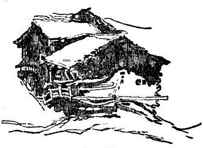
Fig. 30.
Here, then, for I cannot without coloured illustrations tell you more, I must leave you to follow out the subject for yourself, with such help as you may receive from the water-colour drawings accessible to you; or from any of the little treatises on their art which have been published lately by our water-colour painters.244 But do not trust much to works of this kind. You may get valuable hints from them as to mixture of colours; and here and there you will find a useful artifice or process explained; but nearly all such books are written only to help idle amateurs to a meretricious skill, and they are full of precepts and principles which may, for the most part, be interpreted by their precise negatives, and then acted upon, with advantage. Most of them praise boldness, when the only safe attendant spirit of a beginner is caution;—advise velocity, when the first condition of success is deliberation;—and plead for generalisation, when all the foundations of power must be laid in knowledge of specialty.