Полная версия
The Artist’s Watercolour Problem Solver
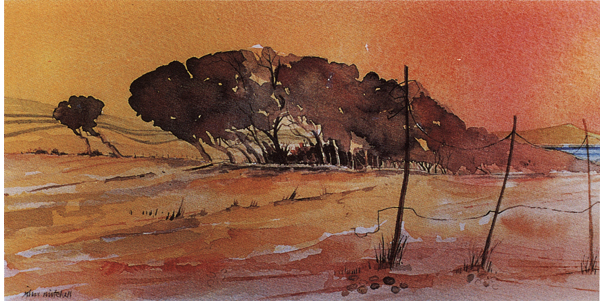
Looking East from the Serpentine
12.5 × 28 cm (5 × 11 in)
This is a favourite location for landscape to which I return again and again. This version was developed from one of the thumbnail sketches illustrated opposite. I attempted to keep the colour fresh and lively throughout and worked to a limited amount of time.
Take time to plan your composition on a small scale before you start. Make a few thumbnail sketches to make sure everything is in the right place. Do a small colour sketch and even a tone sketch so that you can begin your final painting with confidence.
Think about the right size of paper for the idea. Obviously, a single book of watercolour paper limits you, so buy paper in individual sheets to have the option of working to any size. Give yourself enough room in which to work; every painting needs its own space.
Perhaps the subject would be best done on tinted paper. So why not try a small sketch or a range of colours before making up your mind?
Having got the composition and paper size right, think about some technical details, such as choosing a suitable brush. I frequently have to suggest to students that they should try using a larger brush. How can a fresh, exciting painting be made by fiddling away with a very small sable? It’s impossible. Sable brushes are expensive, but you do not have to use these. Ranges of excellent synthetic brushes are available. You could also experiment with decorator’s brushes.
It is worth trying out your different types of brushes to see what effects you can achieve. A sable brush will make a different mark from a harder hog brush, while a soft goat’s hair brush will be different from a synthetic bristle. A same size hake or chisel-shaped brush can be used to produce both broad and detailed marks.
Having chosen a suitable brush, use it to put the colour on, then leave the painted surface alone! Try not to fiddle with your painted areas once they are done. We are all tempted to go over areas we like but this must be resisted at all costs if a ‘tired’ painting is to be avoided.
LIMIT YOUR COLOURS
A simple way of getting fresh colour is to use a limited range of pigments and to try to mix only two colours together. Here is my recommended list for a basic palette: Lemon Yellow, Cadmium Yellow, Cadmium Red, Permanent Rose, Coeruleum, and French Ultramarine. These six colours will give you unlimited mixtures. Adding Burnt Sienna and Burnt Umber will allow you to mix dark shades easily.
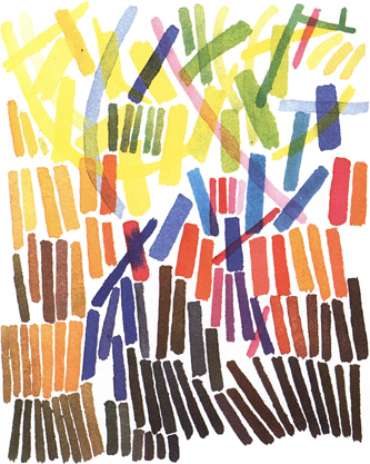
A sample range of colours from my suggested palette. Try using a restricted palette and explore it by making simple exercises.
Notice that I have omitted black. Unless used carefully black can produce a dirty-looking mixture. Mix French Ultramarine and Burnt Sienna or Burnt Umber to get a rich dark tone. All the illustrations for this chapter have been painted using this palette.
It is important when mixing a wash to make more than you think you will need. There is nothing worse than running out of colour two thirds of the way through covering an area, and allowing the edge to dry out as you try to mix more. Remember, too, that washes often dry lighter. When painting some areas, such as the sea, you can miss out tiny areas of the wash, allowing the white paper to sparkle through.
Have you tried working onto damp paper? This allows colours and washes to flow together loosely. It also encourages accidental effects that can add excitement to any painting.
LIMIT TEXTURES AND TIME
It might help to reduce the range of textures you include in each painting. Unless done selectively, textures can produce a rather tired surface.
Have you thought of working to a time limit? This is another simple way to keep your paintings fresh. It certainly helps to answer the old question of ‘how do I know when I’m finished?’ Using a time limit will give a sense of urgency and attack to your work. If combined with thorough preparatory work, this is an excellent stimulus to producing a fresh painting.
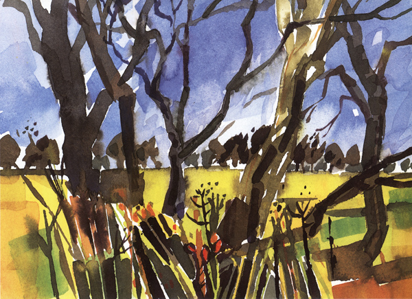
Woodland Study
15 × 21 cm (6 × 81/4 in)
A large brush can be used in different ways: full width for broad effects, edgeways for linear work. The corner can be used for detailed areas. Try to use a bigger brush than you think you need – this will avoid your ‘fiddling’ with the painting and spoiling your work.
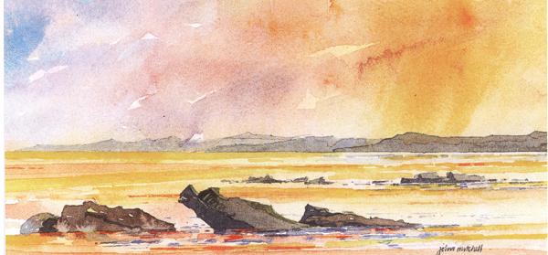
Evening Tide, Largo Bay
10 × 21.5 cm (4 × 81/2 in)
I allowed myself only 40 minutes to complete this painting. The discipline of working to a fixed time encourages freshness in any painting.
USE CLEAN WATER!
It is impossible to produce clean, lively paintings using dirty paint brushes and water. I know this seems obvious, but it can be forgotten about. Before starting to paint, rinse your brushes out in clean water to get rid of any accumulated paint. A wash can be ruined if brushes are not clean.
Given that water dirties very quickly, how can you keep it fresh? The answer is not to use just one small water jar. You need a water source for cleaning brushes, and another for colour mixing. Use a plastic bucket of water in which to rinse your brushes, and a smaller jar to hold clean water for mixing. Make sure that you replenish this smaller jar regularly.
If you follow some, or all, of the advice in this chapter you will eliminate any ‘tiredness’ in your paintings. This will give you more pleasure from your work, as well as improving its quality.
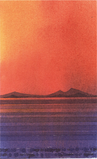
Seascape
18.5 × 11.5 cm (71/4 × 41/2 in)
This small painting was started with a variegated wash onto damp paper. This encouraged colours to flow together in a clean and spontaneous way. After allowing this first wash to dry, other washes were laid on top to suggest mountain and wave forms. The white highlights were scratched out with a sharp blade.
3
START TO FINISH
Why do I have problems working up a satisfactory finished picture from an exciting sketchbook study?
Answered by:
Judi Whitton
Racing home, we rounded the bend. Suddenly, before us was the most lovely subject for a painting. We quickly parked. Time was limited, so out with the sketchbook, and I made a hasty study in pencil with just the essential details – a little tonal shading and a few colour notes. I took a photograph and jumped back in the car and we carried on with our journey.
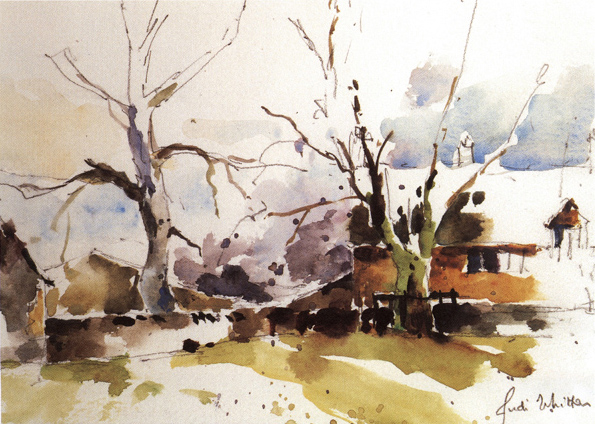
Winter Scene
15 × 20.5 cm (6 × 8 in)
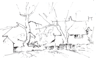
It was a dull, rainy day. I sketched from the car and there was little tonal contrast. It all seemed very unpromising but my sketch (right) became a challenge. I tried to compensate for the narrow tonal range and emphasized any local colour. Above all, I stopped while the painting still had the ‘sketchbook feeling’.
FROM SKETCH TO PAINTING
Some time later, back in the studio, I used my sketch as a reference to complete a successful watercolour painting that exactly portrayed my impression of what I had seen.
Or did I? In fact, it is most unlikely! In the ideal world this is what is expected; after all, Turner produced some stunning watercolour paintings based on little spidery sketches. He travelled on horseback without the company of a state-of-the-art camera. So why is it so difficult? What is the missing link?
This is the dilemma. How often have I heard a fellow artist say that they were pleased with their sketch, but disappointed with the finished painting. I have had many long and intriguing discussions about the problems that arise when working up a successful painting from a promising sketch. These problems can occur either in the studio after the sketch has been made, or outside when a sketch has been used as a preliminary to the painting.
I do not believe that the basic problem lies in how the sketch itself is made. Whether it is a thumbnail sketch, a detailed line drawing, a tonal study or even a little painting, there seem to be many pitfalls before the final painting is produced. The problem seems to lie in how the sketch is used to produce the painting.
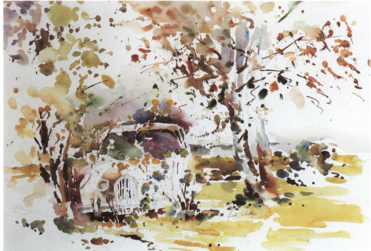
Hidden Treasure
32 × 48 cm (121/2 × 19 in)
What an irresistible subject! But I was careful in the way I painted it. The sketchbook enabled me to choose the angle I liked. As in Winter Scene, the light was so poor that a photograph was impossible, and my sketches were invaluable.
WHICH SKETCHES SHOULD I USE?
The first question to ask yourself is whether the subject is right for a finished painting. Some people might think that a particular subject is ideal for a sketchbook study but there is not enough ‘weight’ in it for a finished painting. The magical thing about being an artist is that there are no rules. The illustrations here show the sketch and final painting of a winter scene. I framed it like this because I felt I had finished it, even though there was not a great deal of content. I did not really have any more to say and hoped I had caught the essence of the subject. But what was most important was that this picture still had the ‘sketchbook feeling’ about it.
HOW TO KEEP THE SKETCHBOOK FEELING’
Is the ‘sketchbook feeling’ the missing link? What is it about an artist’s sketchbook that we all love? I have often watched artists demonstrate at our local art society. Usually they bring along a few of their finished framed pictures and then generously pass round their sketchbooks while doing the demonstration. Somehow, the sketchbooks never get very far round the room because someone in the audience becomes totally absorbed in it.
Why is it that the sketchbook is so fascinating? So often it is full of life and vigour and a sense of spontaneity, which is sometimes lacking in the framed work. Also it is a ‘private’ thing. A sketchbook is for the artist’s use. Generally it is not intended for public scrutiny, so there is a personal feeling about it. It is these qualities of spontaneity and ‘personal’ experience that you should strive to hold onto in the finished work.
CHOOSING THE SIZE OF THE FINISHED PAINTING
Having decided that you would like to use your sketch as the basis for a watercolour painting you then need to decide what size of paper would be best. If the sketch sits comfortably on the page it is probably useful to use a piece of paper for the finished work that is of the same proportions as the pages of the sketchbook. This seems obvious, but it does help!
As regards the size of paper, as ever, there are no rules. I suggest that you envisage the final picture and imagine what would look best. A detailed sketch of a busy street scene can look charming as a small picture, whereas a simple expansive beach subject might be perfect on a grand scale where the brushstrokes can be bold.
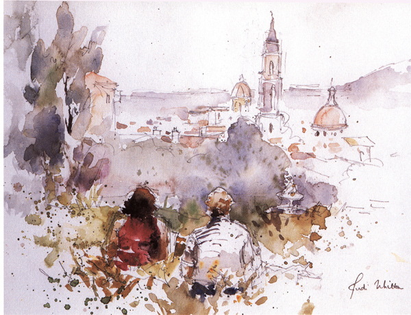
Sarah and Barbara Painting Florence
24 × 29 cm (91/2 × 111/2 in)
I had intended to depict the wonderful panorama of Florence. But who could resist concentrating on my friends, settled in the grass? I realized from my sketch that I needed to change the emphasis of the painting.
USING THE SKETCHBOOK
I came across the subject for the painting Hidden Treasure (opposite) a few miles from home. An old Jaguar car was well hidden in the foliage. I was a bit worried that the subject was rather whimsical and I was most anxious not to make it too pretty or ‘greetings cardish’. Although the light was poor and it was a little boggy underfoot I hoped that I would have time to do the painting on site.
I made a few sketches of the car and trees from different viewpoints. On this occasion I was using the sketchbook to investigate different compositions rather than with the intention of preparing a subject to work into a finished painting in the studio. The sketches would also be useful if interrupted during my painting.
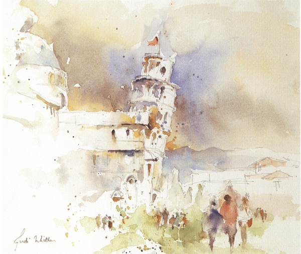
Pisa
21.5 × 26 cm (81/2 × 101/4 in)
I tried to keep ‘fresh eyes’ as I looked at this familiar place. The sketch needed to be accurate and it helped to incorporate the movement of people into the composition.
By walking around the car and sketching I was both studying the subject and thinking about how to paint it. (I took a photograph, too, but when I looked at it later it was totally useless as the car was completely hidden in the shadows.) I was most anxious to convey the impression that the trees and car had become ‘one’ and to keep a lively feel to the foliage. I tried hard not to overwork the painting, and this is where sketches can help to form your ideas at the beginning.
In Sarah and Barbara Painting Florence on my sketchbook was invaluable. I was painting in Italy with my friends. After problems with onlookers I had tucked myself away in a quiet spot. We were in the Boboli Gardens overlooking Florence and the weather was showery. My friends settled down on the grass. They were much farther apart than shown in the painting and I used the sketchbook to bring them closer together and to position them sympathetically with the panorama in front of us. I had originally intended to concentrate on the wonderful view of Florence, but I could soon see from my sketch that my friends were the most important part of the painting! In addition to this the sketch also became my insurance policy in case my friends moved position, or the threatening rains arrived.
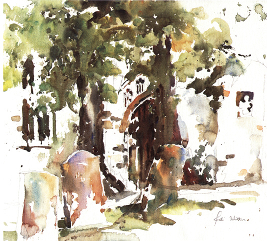
Churchyard, Stow on the Wold
38 × 43 cm (15 × 17 in)
This was painted on the spot with no preliminary sketch. I wonder if it would have gained or lost had I done one?
ACCURACY AND MOVING SUBJECTS
The leaning tower of Pisa (opposite) is so well known that it is difficult to keep the spirit of the place and to paint it as if you are looking at it for the first time. Also I had to ‘edit’ extensive ‘rescue’ works around the base of the building. It was hard not to exaggerate the ‘lean’ on the tower. In this case the sketch needed to be accurate as well as conveying the beauty of this exquisite structure. It was interesting to observe that the flagpole on top of the tower was vertical. Here the sketchbook was useful, too, to record the people and incorporate them into the study, rather than make them look as if they were an afterthought.
DO I NEED A SKETCH?
The painting of the Churchyard, Stow on the Wold (above) is included here even though I decided to make no preliminary sketch for it. I looked at the subject for some time and made decisions, and then just painted it. Sometimes I prefer not to give any concentration to the sketch and save all my resources for the painting. Bearing in mind the expression ‘analysis leads to paralysis’, I worry sometimes about the slight risk of over-preparing for a painting and going a bit stale, especially as watercolours often benefit from a feeling of spontaneity. But there is no substitute for doing a lot of thinking before and during the painting.
OVERALL VIEW
From these experiences I have tried to learn the best way of interpreting sketchbook studies. The major problems have arisen when my sketch looked very acceptable and I have simply used it to complete the finished work without ever establishing what the sketch was really about. Somehow, these pictures lack vitality. Although considerations such as composition, tonal balance and colour relationships are important in all work, it is the feeling that the painting evokes that makes it special.
To summarise: there are no rules. If you like your sketch, think about what it is that you like most. Extract the essence, and keep that idea uppermost in your mind as you tackle the painting. When you feel you have ‘said it’, it is time to stop.
4
ENHANCE YOUR COLOURS
How can I use colour to give vitality to a subject and make it appear almost more real than it is?
Answered by:
Paul Riley
When painting it is natural to regard colour as like for like. By this I mean that we tend to see the view before us as a kind of photograph where the colour is local, sometimes given vibrancy by the sun. However, when it is painted as such the result often looks disappointing, drab and dull, rather like an instant photograph. The reason for this is that the colour is not exaggerated enough.
HEIGHTENING COLOUR
It helps to remind yourself that you are compressing nature into a smaller format. The vast landscape, for example, is to be reduced and distilled to fit onto a piece of paper or canvas in such a way as to indicate the intensity of the sun’s effect on foliage, water, flowers or flesh.
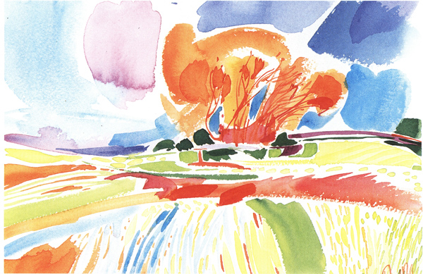
Autumn Tree 1
29 × 39 cm (111/2 × 151/4 in)
This was painted in primaries and secondaries using only the six colours described in the text. They were applied in various ways from stripes to dots and merging soft edges.
This approach applies, I believe, to all media on all surfaces. Thus, when thinking about how to represent a blank white wall it is necessary to see all the subtle nuances of colours that are present in it in order to make it appear real.
For example, the blue of daylight from an adjacent window will merge into violet where the white of the wall picks up the red-orange electric light. This, in turn, can cause yellow casts, which can then be tinted again by light bouncing from the floor covering, whatever that may be. All this is apart from any surface blemishes on the wall that can add further colour variations.
When seeing these variations a painter needs to heighten them to make the subject appear almost more real than it is. The same, for example, applies to shadows that are not necessarily the grey drab areas that they seem. Look deeply and you will see that they reveal colours more vibrant than their illuminated counterparts.
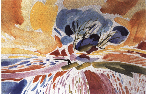
Autumn Tree 2
29 × 39 cm (111/2 × 151/4 in)
I repainted Autumn Tree 1 using the complementary colours. This resulted in some exciting surprises – blue tree, orange sky, red fields!
COLOUR MECHANICS
To understand how to apply colour you need to know how it works. In transparent media like watercolour, inks and transparent acrylics there are two issues to consider: chromatics, and pigment behaviour. In opaque media pigment behaviour is not critical. Chromatics affects all media, and may be divided into hue and tone. Hue refers to the colour of something, tone to the lightness or darkness, within a particular hue. A hue – primary, secondary or tertiary – is specific.
Let us look at the primary colours. The first point to note is that the colour manufacturer cannot make an absolute primary. Red, for example, will invariably be tainted by the other two primaries: blue and yellow. Yellow and blue are also similarly affected – yellow by red and blue; blue by red and yellow.
Understanding this radically affects secondary colour mixing. Examples of these primary types are as follows:
1)yellow red=Cadium Redblue red=Permanent Rose (quinacridone)2)red yellow=Cadmium Yellowblue yellow=Lemon Yellow3)red blue=French Ultramarineyellow blue=Phthalo BlueTherefore to mix true secondaries from these primaries you should use the following colours:
1)Green:mix a blue yellow – Lemon Yellow – and a yellow blue – Phthalo Blue.2)Orange:mix a yellow red – Cadmium Red – and a red yellow – Cadmium Yellow.3)Violet:mix a red blue – French Ultramarine and a blue red – Permanent Rose.Any other mixes from these colours will produce a tertiary colour, which is perfectly acceptable but must be understood as such. For example, mixing Cadmium Yellow with French Ultramarine is the equivalent of mixing yellow, blue and a proportion of red. Producing tertiaries like this is a way of neutralizing a colour.
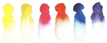
Primaries
(left to right): Lemon Yellow (yellow and blue); Cadmium Yellow (yellow and red); Permanent Rose (red and blue); Cadmium Red (red and yellow); Phthalo Blue (blue and yellow); French Ultramarine (blue and red).

True secondaries
(left to right): Lemon Yellow and Phthalo Blue; Cadmium Yellow and Cadmium Red; Permanent Rose and French Ultramarine.

Tertiary secondaries


