
Полная версия
The Indoor Artist


COPYRIGHT
Collins, an imprint of
HarperCollins Publishers 77-85 Fulham Palace Road Hammersmith, London W6 8JB
The Collins website address is:
www.harpercollins.co.uk
Collins is a registered trademark of HarperCollins Publishers Limited.
First published in 2004 by Collins
Editor: Diana Vowles
Designer: Anita Ruddell
Photographer: Syd Neville
© Linda Birch, 2004
A catalogue record for this book is available from the British Library
Linda Birch asserts the moral right to be identified as the author of this work.
All rights reserved under International and Pan-American Copyright Conventions. By payment of the required fees, you have been granted the nonexclusive, nontransferable right to access and read the text of this e-book on-screen. No part of this text may be reproduced, transmitted, downloaded, decompiled, reverse-engineered, or stored in or introduced into any information storage and retrieval system, in any form or by any means, whether electronic or mechanical, now known or hereafter invented, without the express written permission of HarperCollins e-books.
The illustration on page is reproduced courtesy of the Tate, London.
HarperCollinsPublishers has made every reasonable effort to ensure that any picture content and written content in this ebook has been included or removed in accordance with the contractual and technological constraints in operation at the time of publication.

Source ISBN 9780007151486
Ebook Edition © NOVEMBER 2014 ISBN: 9780008124281
Version: 2014-11-14
DEDICATION
To my mother, Elizabeth Birch

CONTENTS
COVER
TITLE PAGE
COPYRIGHT
DEDICATION
INTRODUCTION
A PLACE OF YOUR OWN
SELECTING THE RIGHT MEDIUM
WORKING FROM YOUR PHOTOGRAPHS
LOOKING AT SHAPE AND FORM
PAINTING STILL LIFE
PAINTING IN THE HOUSE
INDOOR LANDSCAPES
PAINTING FROM YOUR WINDOW
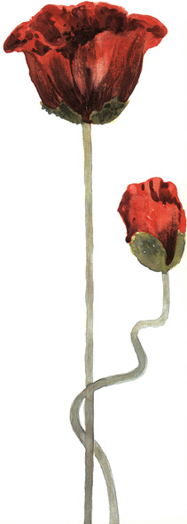
PAINTING FLOWERS
PAINTING YOUR GARDEN
PAINTING PEOPLE
PAINTING ANIMALS
WORKING BIG, WORKING SMALL
EXPLORING COLOUR
CREATIVE & EXPERIMENTAL TECHNIQUES
ACKNOWLEDGEMENTS
ABOUT THE PUBLISHER
INTRODUCTION
This book came about as a result of my encountering many painters who cannot – or choose not to – paint outside ‘in the field’. There are a variety of reasons for this: some live too far from the countryside or lack transport to reach it easily; some are discouraged by unreliable weather conditions; others are not in sufficiently robust health to undertake a trip to paint outside, while many women do not feel safe alone in isolated places.
If you are one of these artists who are not able to paint outside the home you probably feel frustrated and disappointed by your apparent lack of subject matter. However, being indoors can be a real advantage. Your home really is a place where you have the privacy and time to try out new things, hone your skills and find inspiration. I know there are some who maintain that you can only produce a real painting if you work al fresco. Not true! Until the 19th century, all artists painted indoors. Even Turner regarded his outdoor work as sketches meant for his eyes only, prior to painting his more finished work. While his sketches are sometimes prized above his studio paintings, being indoors does not mean you necessarily lose freshness – it depends what and how you paint.
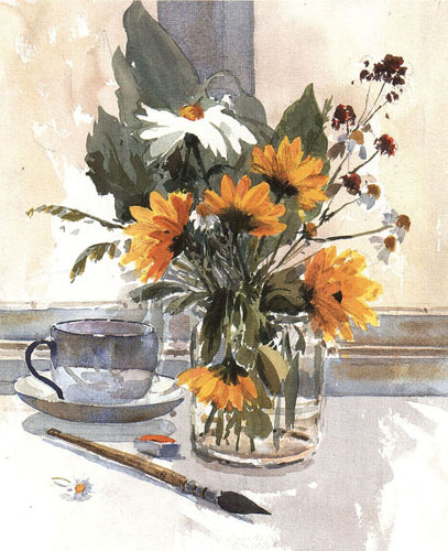
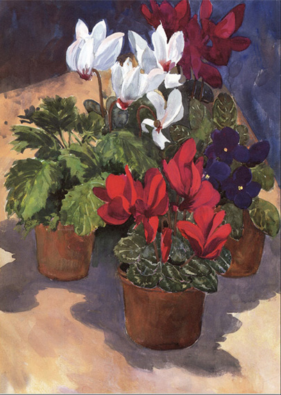
Indoor Flowers
36 × 26 cm (14 × 101/4 in)
Being indoors provides an ideal opportunity to paint flowers and still life. It also gives you time to study form and colour at close range.
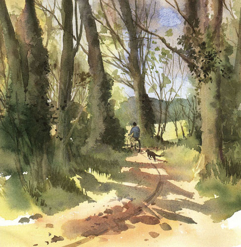
Country Path
27 × 27 cm (101/2 × 101/2 in)
Being inside doesn’t have to stop you painting the outside! You can work from sketches or photographs, or even use props to re-create an outdoor scene.
This is not a ‘how to do it’ book, since there are plenty of those already available if you need them. Instead, it is intended to act as a resource for ideas and inspiration if, for whatever reason, you are not able to go outdoors to paint. Although it deals predominantly with watercolour, the same ideas can be applied to whatever your medium happens to be. I hope you will find that they bring new life and energy to your painting.
A PLACE OF YOUR OWN
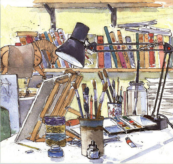
A Place to Work
24 × 32 cm (91/2 × 121/2 in)
Every artist needs a permanent place to work with a desk, a chair and a lamp. Working materials can be left out ready to use – and to act as a subject, too.
Everyone who paints needs a place of their own to do it in. It is not easy if you need to clear the dining-room table every time you want to paint and then tidy your equipment away before the next meal. You must have a place to work, to think and to make a mess! Creativity is not a neat affair that can be set up and tidied away at the end.
You don’t need a large studio for the purpose – a corner of a spare room and a large table will do, just so long as it is your place where you can be left alone to work out your creative ideas.
ORGANIZING YOUR SPACE
Consider the options your home affords you for a dedicated work space. You may be fortunate enough to be able to take over a spare bedroom and turn that into your studio. However, if you have only the corner of that spare bedroom don’t despair – there are many ways of combining living and working spaces today, and rooms are often dual-purpose.
You will need a worktable of some sort. This doesn’t have to be a fancy affair, and if you are really short on funds you could consider buying a cheap wallpaper-pasting table from your local DIY store. They are large, practical and cheap, and fold away if you need to store them. One of these sufficed very well as my own first worktable.
Try to arrange your table near a window to catch the light, although the traditional north light is not really necessary. Even if you are working from a subject that needs a constant light direction, daylight bulbs, which can be easily obtained, will do the trick. I prefer to use a spotlight desk lamp to light my still-life groups or flowers. It gives warmth and vibrancy to the colours, whereas daylight bulbs are cooler in hue.
Make sure you have a comfortable chair to sit on while you work at your table. A typist’s chair, which can be bought cheaply from suppliers of second-hand office furniture, will be useful for its adjustable height control, which is vital to avoid developing a bad back. When sitting for long periods I find a footrest useful, which in my case is simply an old box.
Having a place of your own with all that you need laid out in readiness will make it easier to take up your work when you have only a short time available.
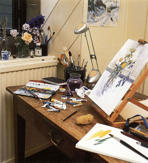
Try to position your table near a window to get the benefit of maximum natural light.
Practical considerations
If you don’t have any spare cupboard space, a small trolley with several baskets designed to hold vegetables makes good (and cheap) mobile storage. You can place sheets of paper under a spare bed to keep them flat and out of harm’s way, and other items you need such as a water jar and inks, spare still-life material and books can be stored on an overhead shelf.
When you are working for long periods of time in one spot, you may need to provide extra warmth. If you only need to keep the specific area you are sitting in warm, consider using a safe form of heating such as an oil-filled radiator which is sealed and can be wheeled to where you want it. It is not advisable to use water in close proximity to electric fires, fan heaters and convectors.
Making space for your subject
When you want to paint a still life or botanical subject, you will need a small table as a base so that you can position it at a suitable distance away from you. If needs be, you can make it much larger by placing a broader sheet of board on top. To cut out distractions from the rest of the room, make a still life ‘box’ from a large empty carton. This will enable you to drape material behind and create light and shadow when the subject is lit by the spotlamp. Alternatively, a shelf placed just below eye level would also make a good site.
If all else fails, try putting the still life on the floor. I once painted a very successful group of tulips placed on a painted wooden floor. Looking down on the flowers meant I could see more of the flowers than the container, which worked well.
SELECTING THE RIGHT MEDIUM
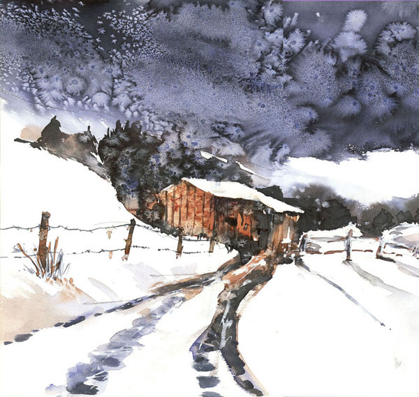
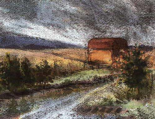
Barn in Snow
38 × 56.5 cm (15 × 221/4 in)
Salt and inks were added to watercolour to create frost and starkness in this winter scene.
Although this book is primarily about watercolour, there are other media that you can use with it. Gouache, an opaque form of watercolour, can be employed for its thicker, impasto quality, while inks give rich, subtle, transparent colour. Both of these can also be used on their own for picture-making. Media such as coloured pencils, pastels, charcoal, wax, salt, clingfilm and paper in the form of collage can all be added to watercolour, giving a variety of textures.
There are many other techniques you can try such as achieving texture with sponges, rough-textured hessian, watercolour sticks, oil pastels and indeed any other media or household items that catch your eye. Allow your imagination to run free, as you will learn even from experiments are not successful.
UNDERSTANDING DIFFERENT MEDIA
Watercolour
The transparent, fresh quality that watercolour possesses makes it ideal for using clear, apparently simple sweeps of colour and capturing the fleeting effects of light. It relies on the use of the paper surface shining through colour washes, and to convey the lightest areas the paper is usually left untouched. Dropping one colour into another (known as painting wet-into-wet) creates melting colour effects of great beauty and subtlety.
Watercolour can be used on specific watercolour papers with three different surfaces: Hot Pressed (HP), which is smooth; Not, a medium-textured surface; and Rough, which is heavily textured. However, it is also worth trying watercolour on stretched papers such as cartridge and pastel papers.

Only two pigments, Cobalt Blue and Burnt Sienna, have been used to create this tower. The feeling of strong light on the building has been conveyed by leaving the paper empty.
Line and wash
Using pen and ink with watercolour will ‘lift’ your work and strengthen the colour as well as adding dark tones. To avoid an overworked look, keep the watercolour a little weaker than you would normally use it. Line can be used before painting (line and wash) or afterwards (wash and line).
Try using various types of pen to achieve different effects. For example, a felt-tip pen with a broad nib will produce strong, contrasting blocks of tone, while a fine-nibbed pen adds a more linear quality to your work. You can even use a garden twig, which yields characterful lines and marks. Make sure the ink is waterproof or it will run into the watercolour.
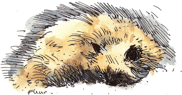
This study of a cat sleeping had to be made quickly, since animals will move when you least want them to. The drawing was made first and a wash of colour was added when the ink was dry.
Gouache
Gouache is an opaque form of watercolour. It is normally worked from dark to lighter tones, using white to lighten colours. In the past it was employed to heighten the light areas of watercolours painted on tinted paper, and was described as ‘body colour’. It was also often used to make small studies preliminary to a larger oil painting, since it can imitate the effects of oil paints.
The textured quality of watercolour paper is not necessary for gouache, and stretched cartridge paper or thin mounting card both make ideal surfaces for this medium. It can be combined with traditional watercolour, provided great care is taken not to destroy the integrity of the latter. Used on its own, gouache is a pleasant relief from the unforgiving nature of watercolour, in that it can be built up and altered in a way that would be impossible in a medium that relies on transparent washes.

Gouache can be applied more thickly than traditional watercolour to produce texture. Here, dense, creamy white has been used to create the surfaces of wall and steps.
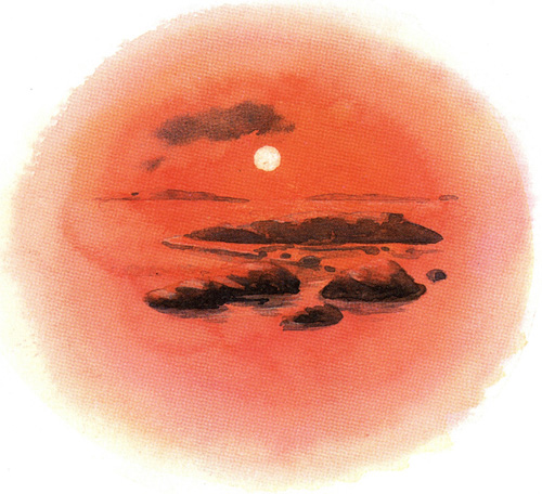
Drawing inks come in a rich range of colours. Here they have been used in transparent layers to create the soft glow of a setting sun.
Inks
Inks are ideal companions for watercolour and their rich, vibrant colours make them exciting for the artist to work with. However, their benefits stretch beyond striking effects. Try using them to glaze a watercolour in order to restore colour balance; they can be mixed and applied in washes to create the subtlest of colours. Because they are waterproof when they are dry, luminous washes can be built up, with none of the muddiness that can afflict watercolour. Nevertheless, the finished result is identical to watercolour.
Most, but not all, drawing inks are waterproof, so it is worth checking the label before you buy. Acrylic inks are waterproof and are available in a sumptuous range of hues.
MIXING MEDIA
Coloured pencils
Coloured pencils and watercolour pencils are a useful addition to a watercolourist’s toolbox. They are capable of astonishingly realistic effects when used by themselves; added to a dry watercolour they can restore texture and brighten or subdue tones without destroying the character of the paint. Try using them, for example, to add tree twigs or fine grasses to a painting.
Both types come in a large range of hues. Pick your own selection of colours rather than buying a box so that you do not waste money on colours you will not use. I find the best colours for adding to a watercolour are the tertiaries – greys, buffs and olive colours. Coloured pencils employed on top of a dry watercolour can even be removed with an eraser if unsuitable. If used wet, watercolour pencils are handy for small works, though they are limited in their ability to create large washes.
Coloured pencil has been added to this watercolour when dry to create texture on the walls of the barn and add grasses in the foreground. A little Ice Blue was rubbed into the background to soften the tone on the background hills.
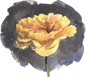
Pastel has been added to this flower in order to increase colour in its centre and create a more even tone in the background.
Pastel
Pastel is good for achieving intensity of colour and for adding texture, but always remember to respect the character of watercolour. Once pastel is added, transparency will be lost, so use it only in areas where it will enhance the painting. However, there will be times when a watercolour will fail, despite all your efforts. Pastel can then be used on top of the painting in order to rescue it. The result will be a pastel painting and not a watercolour, but a painting will have been saved and transformed.
Here charcoal has been applied on top of a dry watercolour. An eraser has been used to lift out the light areas.
Charcoal
Charcoal can be used over a dry watercolour, then rubbed back with an eraser and fingers to reveal an image. Its smudgy grey and black tones help create a feeling of mystery and atmosphere in a watercolour. You can even rescue a painting that has gone wrong by adding charcoal over the top and lifting it out to reveal the areas you choose.
Charcoal is easily smudged, so needs careful handling. It can be sprayed with fixative when complete. Wet watercolour and charcoal do not usually mix well unless you want to create a really sludgy effect – but try it and see. After all, there are no rules that cannot be broken in art.
Wax
Wax is very useful for adding texture or maintaining highlights in a painting. The accurate placing of the wax is important, so a birthday-cake candle makes a better choice of tool than a household candle. Once in place, the wax resists watercolour washes. Apply it before any paint if you want to leave the paper white. As most highlights are either warm or cool rather than true white, the alternative is to add the wax over a light wash of colour, provided it is dry.
Candlewax is particularly good for grainy textures such as tree bark and stones. It can also be used to create sparkle on water. If you enjoy the effect of wax resist and watercolour, consider using oil pastels with watercolour to gain colour as well as texture.
Here I dotted in some wax highlights over a light blue base, then applied mid-tone washes. I made more wax marks to create lowlights before adding the darkest tones.
USING HOUSEHOLD ITEMS
Salt
When added to a drying watercolour, salt produces surprising results. As the crystals dry they draw colour off the paper, resulting in an entirely random speckled effect. The technique most obviously lends itself to winter scenes, such as snow crystals and snowstorm effects. However, there are other places you can employ salt. Try using it to produce a mottled effect on old pieces of wood, or on leafy foregrounds in autumn landscapes. It will produce an interesting background to a still life, and dropped into an area of still water can render effects not possible with a brush. You will need to lay washes of quite deep colours to benefit from the qualities the salt will produce.
You can use table salt or coarse sea salt, which produces larger ‘starbursts’. It is wise to experiment a little first, in order to discover the best time to drop salt onto a painting. Aim to do it a short time after you lay a wash, before it has had time to dry. Don’t continue to add more paint after you have used salt. It needs to be left flat in order to dry, which can take a couple of hours or even longer depending on the temperature of the room. Once it is dry, gently brush off any excess.

Here I dropped salt onto the sky and water areas as the painting dried. I used coarse sea salt, which produces a more starry effect, for the sky, while table salt was added to the water.
Soap
Adding soap to a painting creates a very different feel to the way the brush and paint behave. You need to use liquid soap or shampoo, and substitute it for water. This makes the paint sticky and creates I defined brushmarks rather like painting in oils or acrylics. Bouncing the brush slightly in the soapy colour will produce bubbles. Use soap to achieve craggy textured effects.
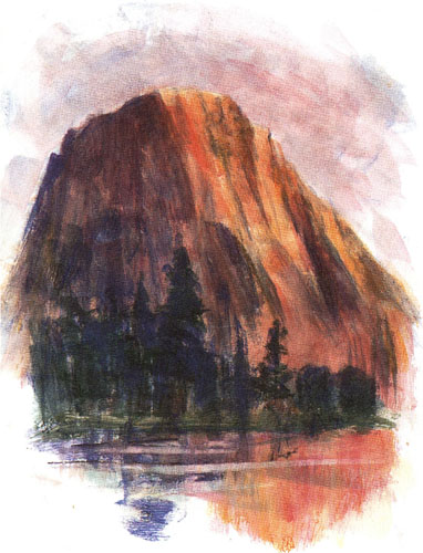
Soap used instead of water is good for rendering strongly textured subjects such as this mountain. The marks you produce will create an impasto result resembling oil paint.
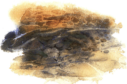
Here clingfilm was used to create ripples on a streambed, though the subject was decided on only after the clingfilm was removed. The stones were then picked out in watercolour.
Clingfilm
Clingfilm laid on top of a wet watercolour produces some really interesting effects. Be prepared to accept what comes – the results are not easily controlled. I find it works best with linear forms such as tree bark, stems and the movement of water. It is a useful spur to the imagination – try experimenting with it to create fantasy landscapes.
To use clingfilm you need to lay some generous, strong washes of colour; water dropped and dribbled onto the wet colour will contribute to the result. Lay the clingfilm loosely over the area and press down gently, allowing the material to crease and wrinkle naturally. Leave flat to dry before lifting off the film to reveal the texturing. Watercolour can then be added to reinforce the chosen image.
Collage